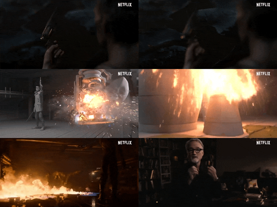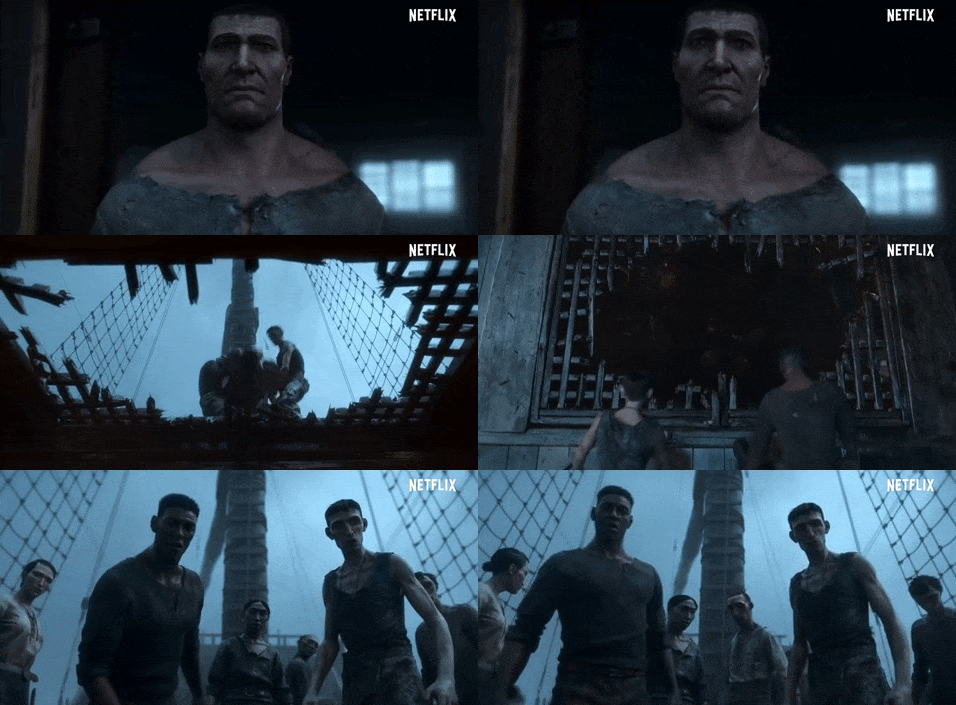
To work with director David Fincher is to adhere to what might seem to be a set of restrictive practices. In Mindhunter, for instance, DP Erik Messerschmidt commented on why a shot bible was so important. “With the exception of two shots in Episode 10, we didn’t use any handheld or Steadicam,” he said. Most of the drama in Mindhunter comes from the characters’ experiences in very long and complex interview scenes. “The content of those scenes is extremely measured and nuanced and I think a moving or shaking camera would have been a very distracting way to tell such a complex story.”
In the “Bad Travelling” episode of Netflix’s Love Death & Robots: Volume 3, making his first foray into animation wasn’t going to stop the famed director from keeping his options open. Animation studio Blur had previously worked with Fincher on the Netflix series Mindhunter and Sony’s Girl with the Dragon Tattoo, and Blur Studio’s co-CG supervisor, Jean-Baptiste Cambier, saw the opportunity to help him flourish in a new medium.
“Some aspects of an animation pipeline offered him a new vision of his own work, too,” Cambier says in an interview with Henry Winchester for the Chaos Group blog. “For instance, during his work with the layout team, led by Aaron Weldon, at the early stages, some cameras were set up in order to see the whole action from above in an almost orthographic view.”
This allowed Fincher and the artists to set up the action as a whole before determining the camera angles. Another obvious point was to be able to refine a performance to get the most out of the story.
To give the director some creative space to exercise his famed intuition in developing the look of “Bad Travelling,” Blur ended up lighting and crafting a few key shots and running all of that specific sequence — even if they had a large number of shots in them.
“By rendering sequences this way at an early stage, we sometimes got a more spontaneous result, and the shots didn’t look overworked, or we found lighting setups we would not have otherwise got. This was part of our way to regain something more instinctive and natural in our lighting approach.”
NOW STREAMING — BEHIND THE SCENES OF FAN-FAVORITE SERIES:
As the streaming wars rage on, consumers continue to be the clear winners with an abundance of series ripe for binging. See how your favorite episodics and limited series were brought to the screen with these hand-picked articles plucked from the NAB Amplify archives:
- True (True) Crime: Making Dennis Lehane’s “Black Bird”
- How “The Staircase” Is a True-Crime Drama in All the Ways
- “Ms. Marvel” (Literally) Brings Some Girl Power to the MCU
- “Severance:” Now, About Solving the Work/Life Balance…
- “Dark Winds:” Developing a New (Overdue) Detective Genre
In his previous films and streaming shows, Fincher was known to keep color palettes to a specific set of tones. In Mindhunter, for instance, the period drama is full of yellow, cyan, brown, and avocado green. However, when it came to final grading, there wasn’t much of a cast or a skewing of the color. “His way of working was always this almost old-fashioned sense of engaging with the actors, dolly grip and camera operator to execute the shot,” Messerschmidt commented. “It’s a beautiful thing to watch.”
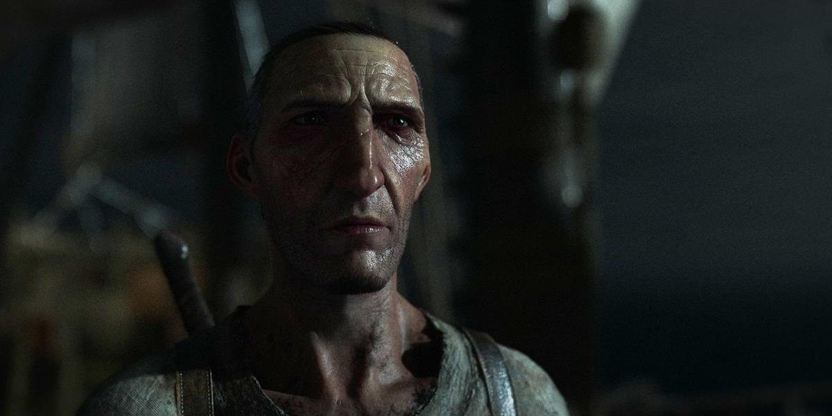
Cambier explained how they created an initial look for “Bad Travelling” before look discussions started with Fincher. “Early on, the look-dev process starts with our art director Alexey Andreev. His first steps are to gather an initial deck of references from various places: movies, paintings, and concepts. Then he proceeds to paint directly on some keyframes of our layout.
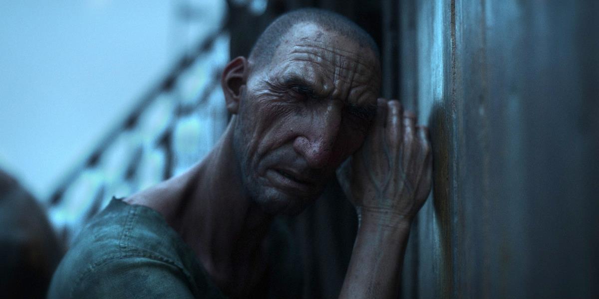
“The story is dark, our characters are under constant pressure, and we wanted to embrace the story with the mood.”
The team mostly referenced films that embraced darkness and horror. They also referenced the strong use of practical lights, so they spent a lot of time digging into films such as The Witch, Funny Games, No Country for Old Men, The Revenant, and The Black Stallion. “Our art director also took cues from paintings by Rembrandt and Ilya Repin because of the interesting and unique ways lighting shaped their faces and bodies. There was a lot of that in our show,” Cambier said.
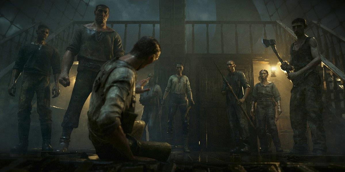
The team started with a still frame of the whole crew standing on the deck of the boat. “From this starting point, we threw in a lot of versions of the same frame under different lighting scenarios and colors. We then got to meet Fincher and showed him that contact sheet. He loved it, and it triggered a very long discussion about what the show should be.”
READ MORE: Behind-the-scenes of “Bad Travelling,” part 1: Collaborating with David Fincher (Chaos Group)
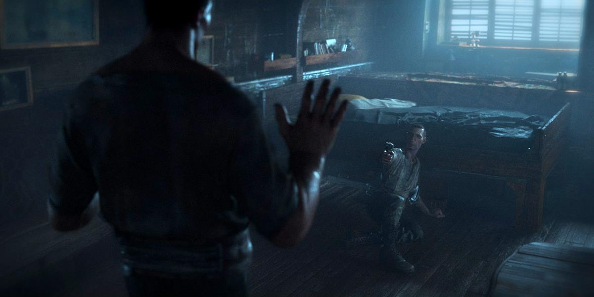
But to further develop the look, Fincher wanted the lighting to tell the story as much as any other tool at the production’s disposal.
Winchester also spoke with Blur Studio compositing supervisor Nitant Ashok Karnik, who described how they had to leave their comfort zones to use lighting to support the story. “Fincher did not shy away from brave choices with lighting. In the tempest scene, he asked us to push the intensity of the lightning flashes — to break some OLED screens with how bright it is,” he said.
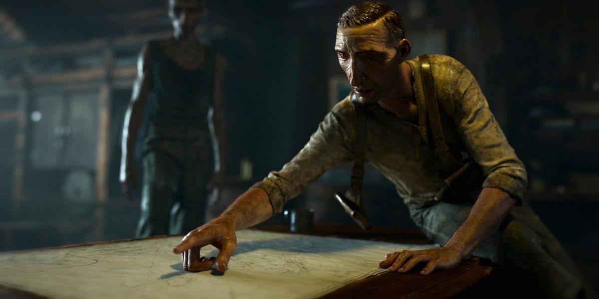
“As an artist, that tells me that I don’t need to be afraid to blow out the image as long as we can read the action. It was liberating to be bold with lighting in this way. I would encourage others to be more ugly and real, than pretty and fake.”
Fincher would also push the team to alter some familiar and perhaps clichéd lighting scenarios. Karnik explains how, “at one point, Fincher mentioned wanting this sunset to feel like the ugliest sunset ever. That’s not something you hear often, but we had some fun with that one since it was the antithesis of every beautiful and romantic sunset you’ve seen.”

There was also a discussion with Fincher about dimming the light even more, and how the lighting tools in Chaos Group’s V-Ray helped him embrace the darkness. “I also told Fincher that one of the key processes of comping a shot is to turn all the lights off, and progressively turn them back on one by one, tweaking them as we go,” Cambier comments.
In fact, Cambier invited Fincher to look at a particular sequence without the key light. The removal of the light would make the shots darker with faces falling into shadow. “It really brought another dimension to the action. Fincher was all for it, and we constructed the sequence together based on this darker lighting scenario.”
READ MORE: Behind-the-scenes of “Bad Travelling,” part 2: How to light like David Fincher (Chaos Group)
