TV shows are made to be screened in 16:9 and films are shown in cinema also in widescreen formats. So why are films and TV shows increasingly being made in old-school 4:3?
We explain.
In the early days of cinema silent films were shot with an aspect ratio of 1.33:1. When sound came along the additional space for the soundtracks moved the ratio to 1.37:1, a standard enshrined by The Academy. Its ubiquity was cemented with the arrival of TV which handily suited the box-like 4:3 format with which the ratio pair are colloquially referred to.
At the same time, cinema started to adopt a wider aspect ratio (CinemaScope, VistaVision) to differentiate it from TV. The standard theatrical aspect ratio — 1.85:1 or 2.39:1 — later parlayed into the reformatting of TV screens to 16:9 (1.77:1/1.78:1) since when wide has remained the standard “with 4:3 aspect ratio pixels a relic of the 20th century,” writes Rafael Abreu in a handy potted history of the subject.
READ MORE: What is 4:3 Aspect Ratio — And Why Do Filmmakers Still Use It? (Studio Binder)
More recently many filmmakers have chosen to return to the boxier 4:3 format — why?
After all modern audiences and many esteemed filmmakers (Chris Nolan, Quentin Tarantino) seem to hold that bigger and wider is better and more spectacular. Only one film shot (mostly) in 4:3 (1.37) has made more than $100 million at the box office. That is Wes Anderson’s Grand Budapest Hotel (2014).
As Fandor’s excellent overview points out, since 4:3 is riskier financially, it’s clearly a very important artistic choice by the filmmaker.
Often the decision is as simple as evoking a certain time period.
Films like The Artist (best picture Oscar winner in 2011) used 1.37 since it chimed with a story about early Hollywood told in black-and-white and silent.
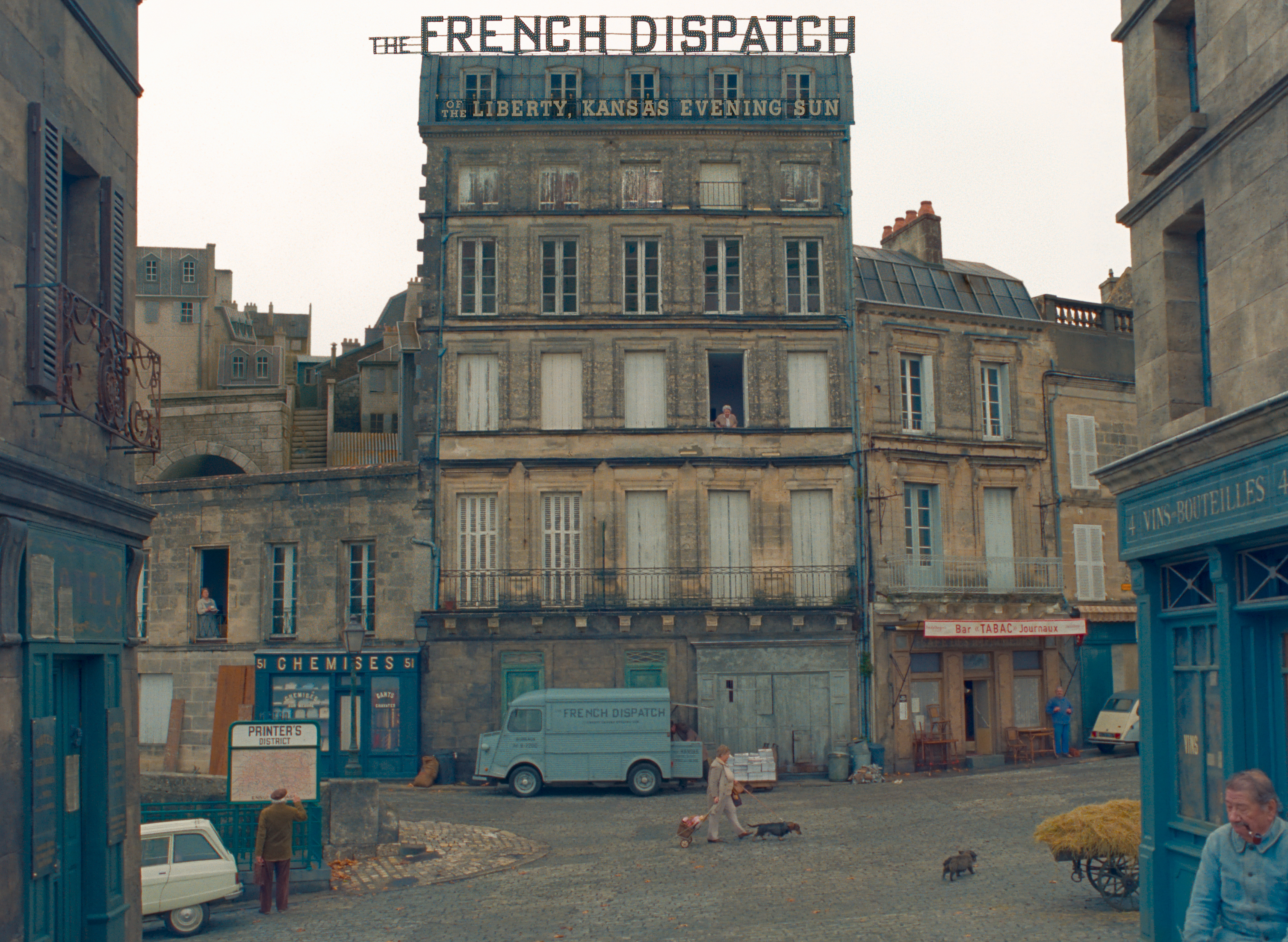
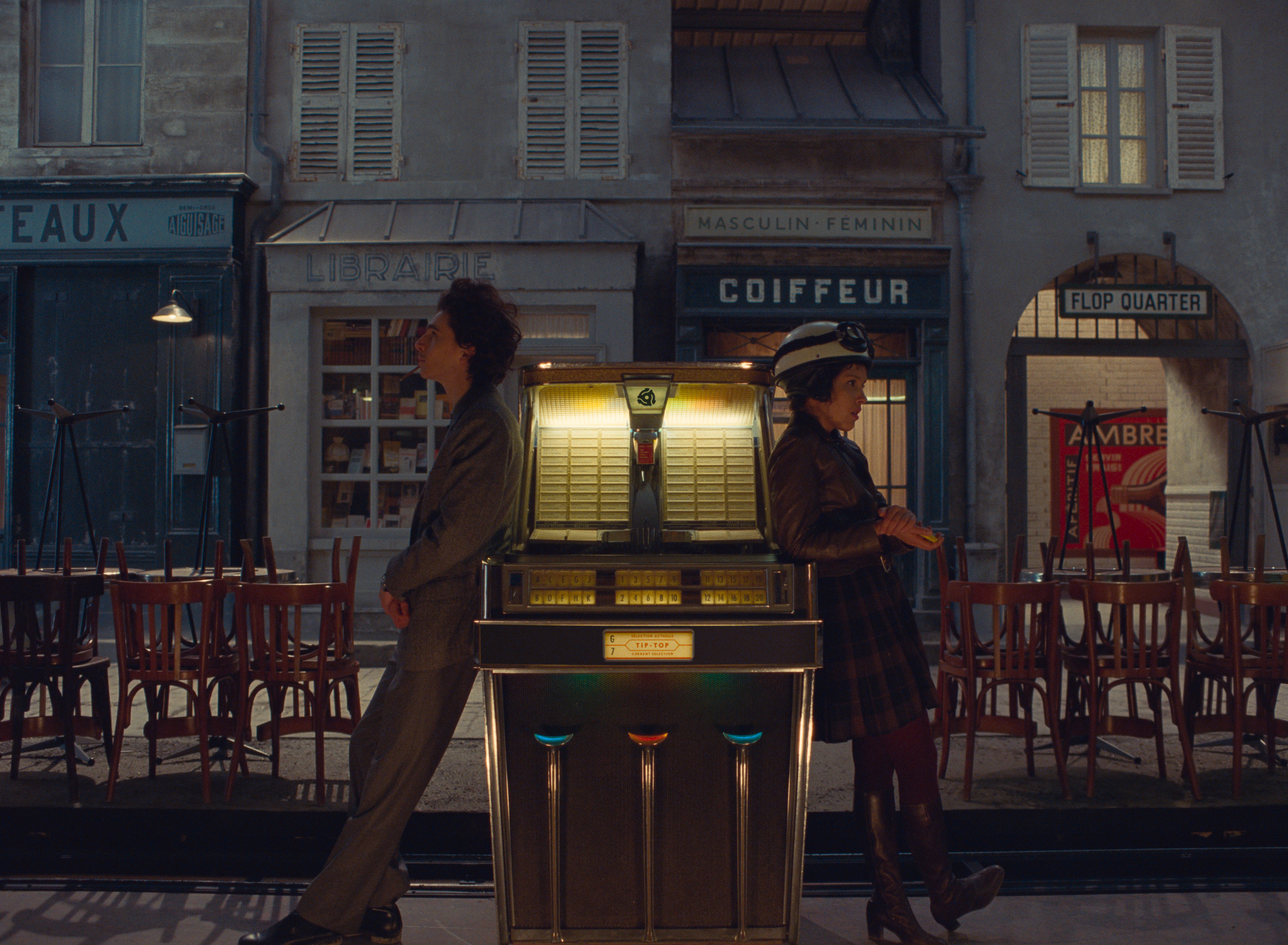
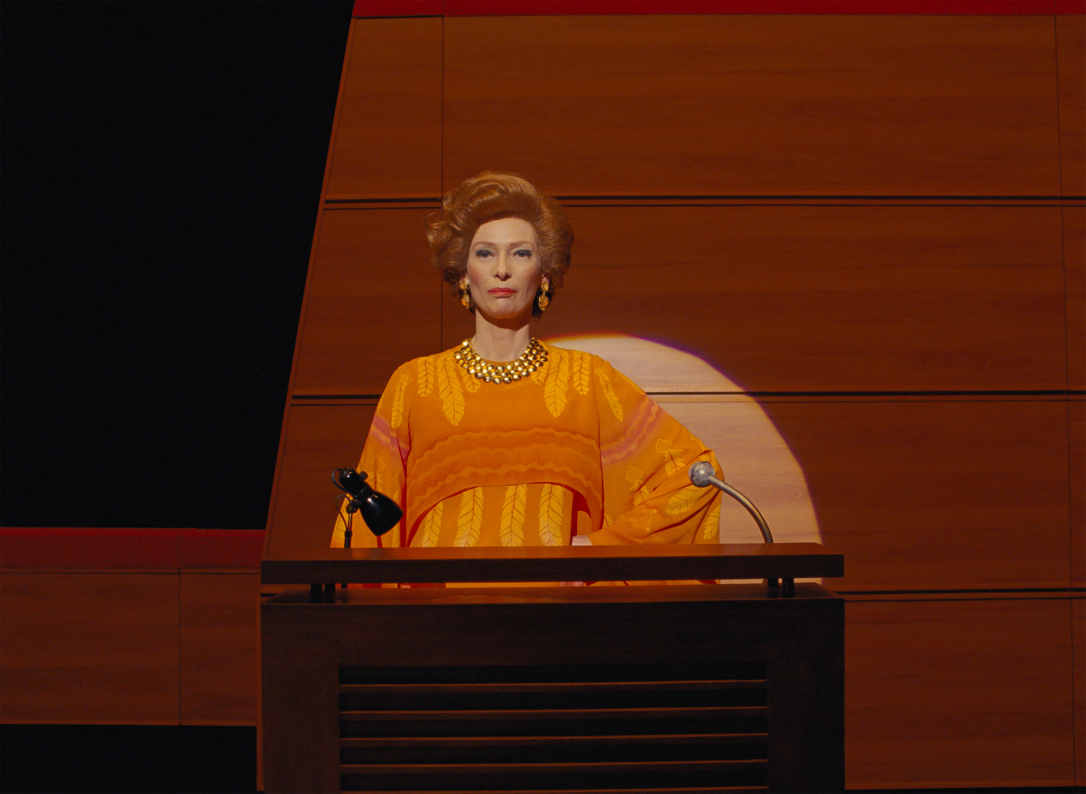
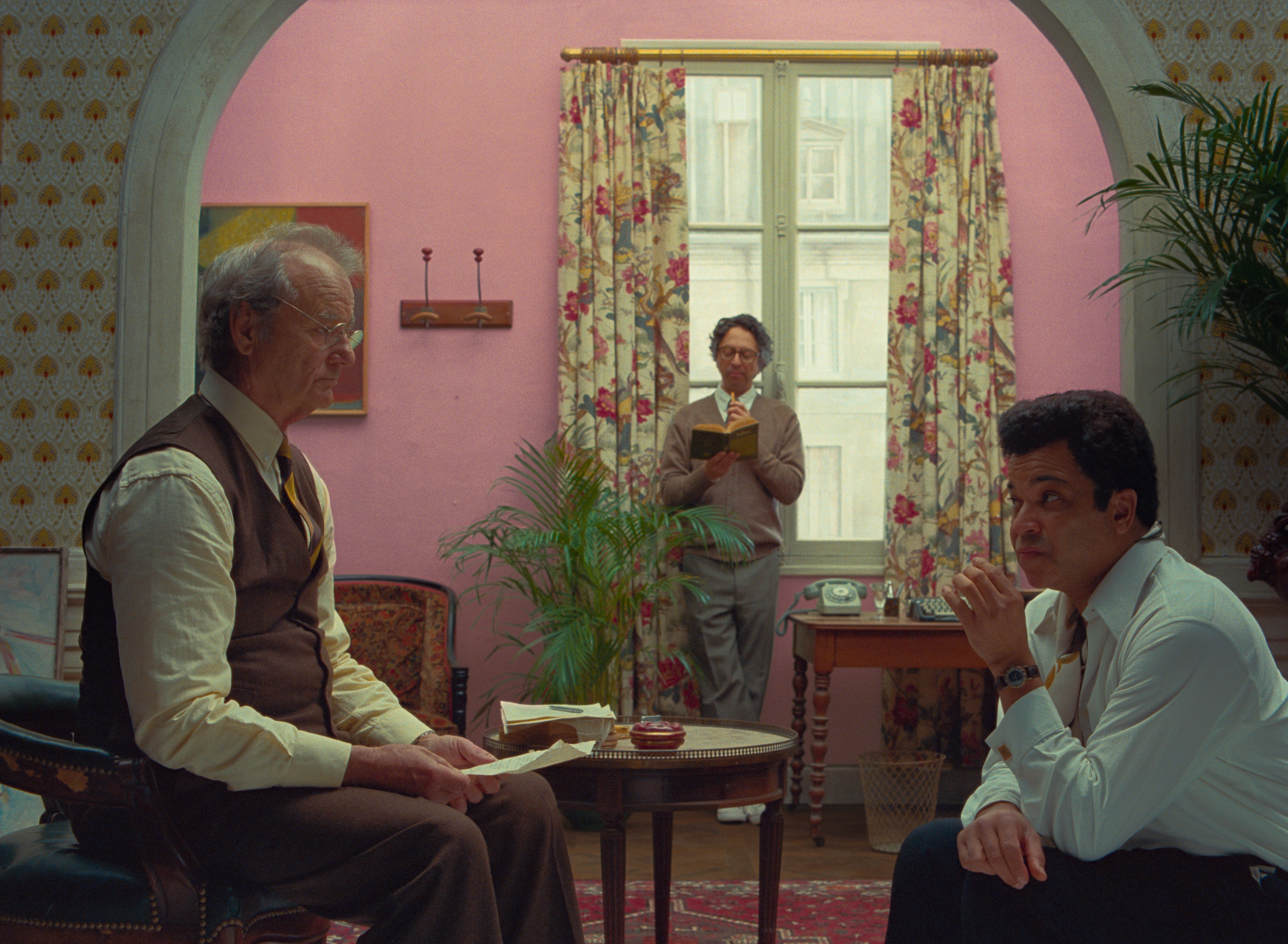
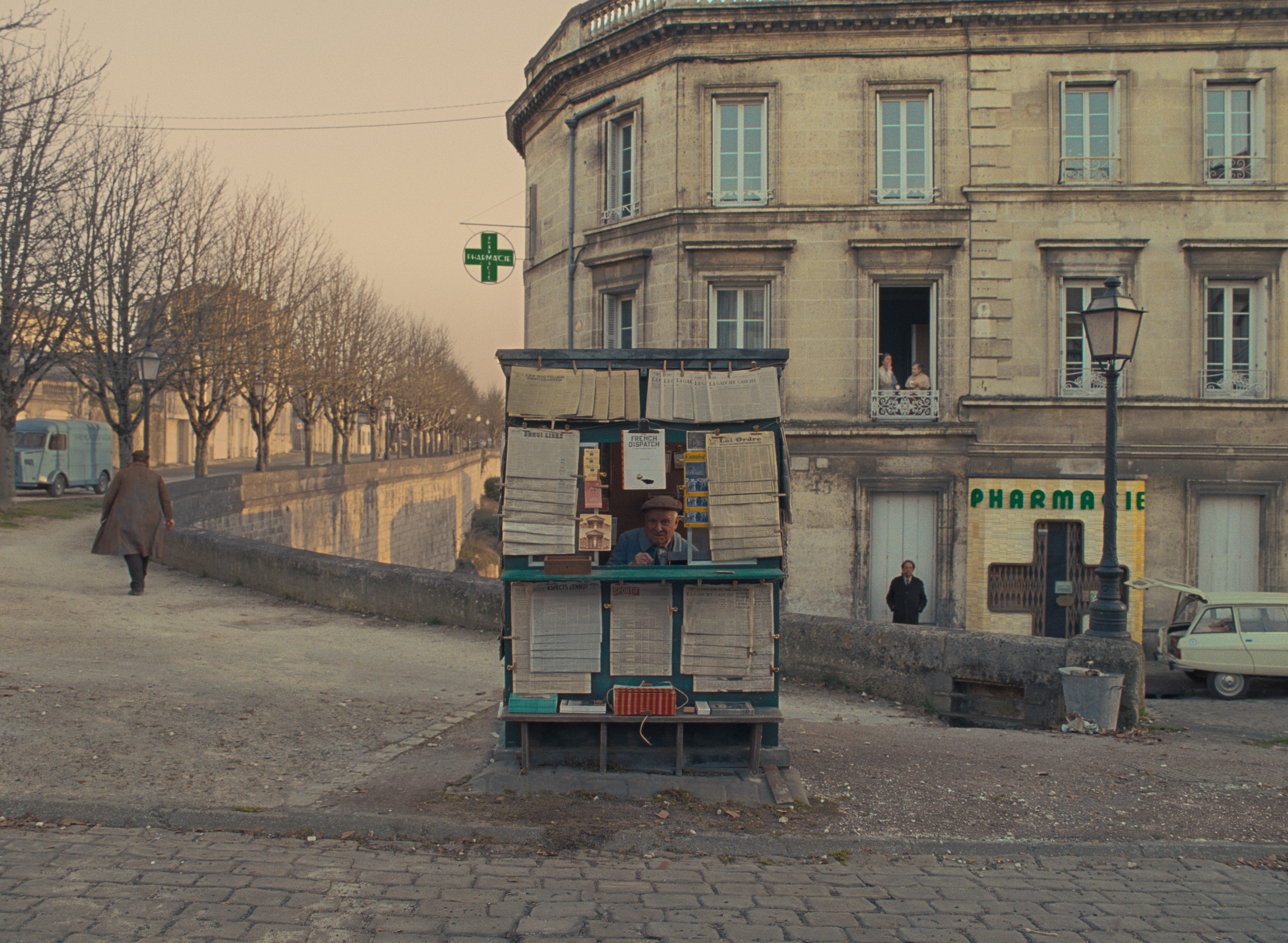
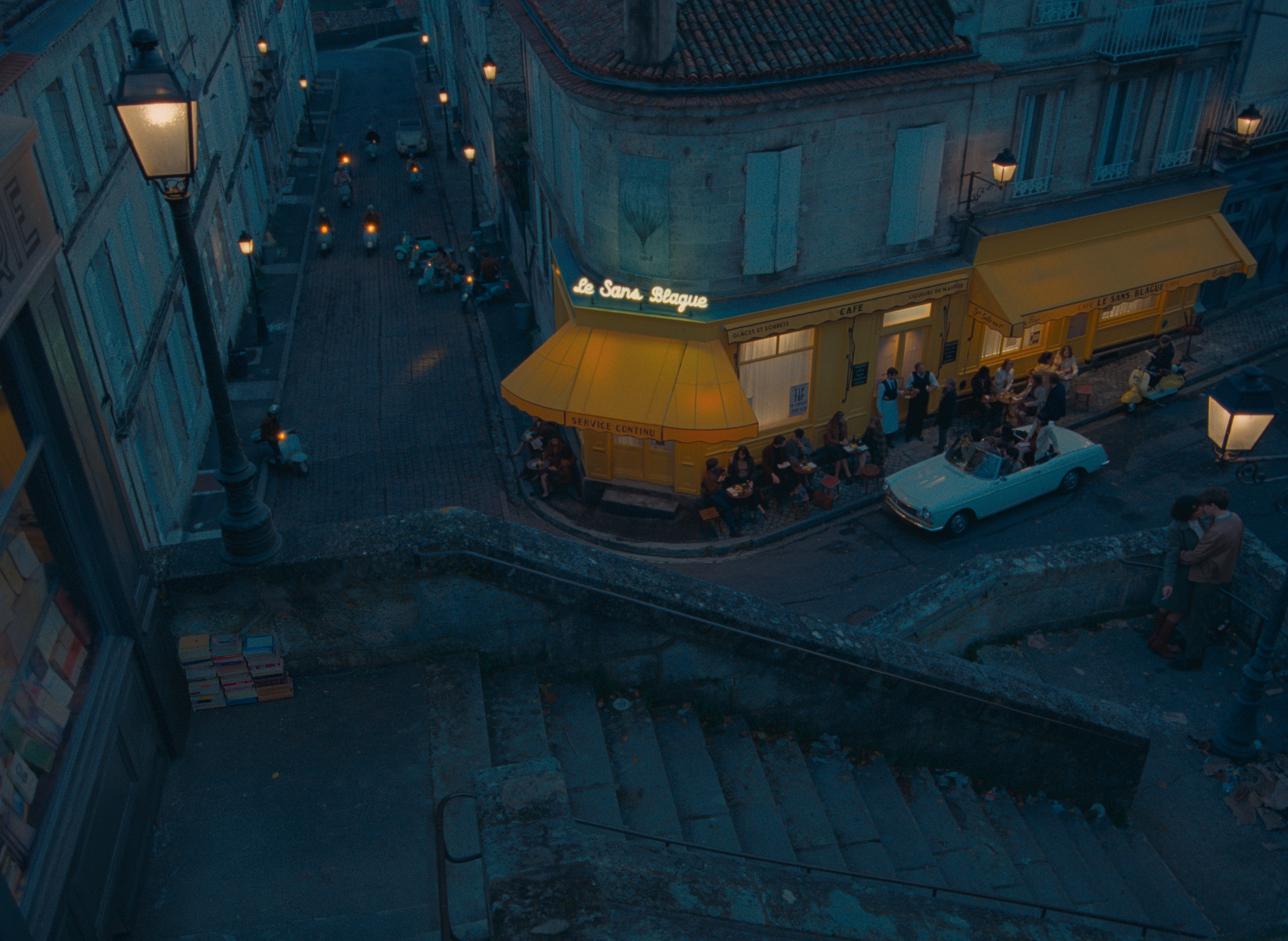
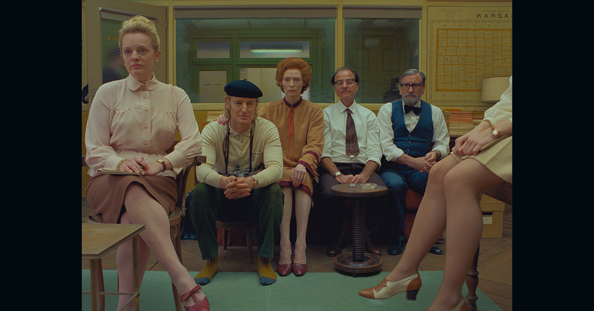
In Grand Budapest Hotel, DP Robert Yeoman shot 1.37 for the scenes that take place with concierge Gustave to signify the time period of the 1930s and 1940s. It’s a technique he also uses on Anderson’s latest The French Dispatch.
“We loved the compositional possibilities that this aspect gave us and so carried this over to The French Dispatch,” Yeoman says. “Occasionally we would change to a wider ratio for emphasis, just as we did using color.”
READ MORE: Behind The Scenes: The French Dispatch (IBC 365)
Even if a film takes place in an era after the emergence of widescreen format, 4:3 can still be used to enhance the feeling of an earlier time, notes Fandor’s Jacob Swinney.
READ MORE: Forget Widescreen: The Academy Ratio is Back (Fandor)
It’s a Period Choice
Jonah Hill’s Mid90s (2018) for example was shot in 4:3 to convey nostalgia for the titular era.
Director Paweł Pawlikowski and DP Łukasz Żal filmed Ida (2013) in 4:3 not just to hint at the 1960s storyline but also because they wanted the characters to dominate the frame.
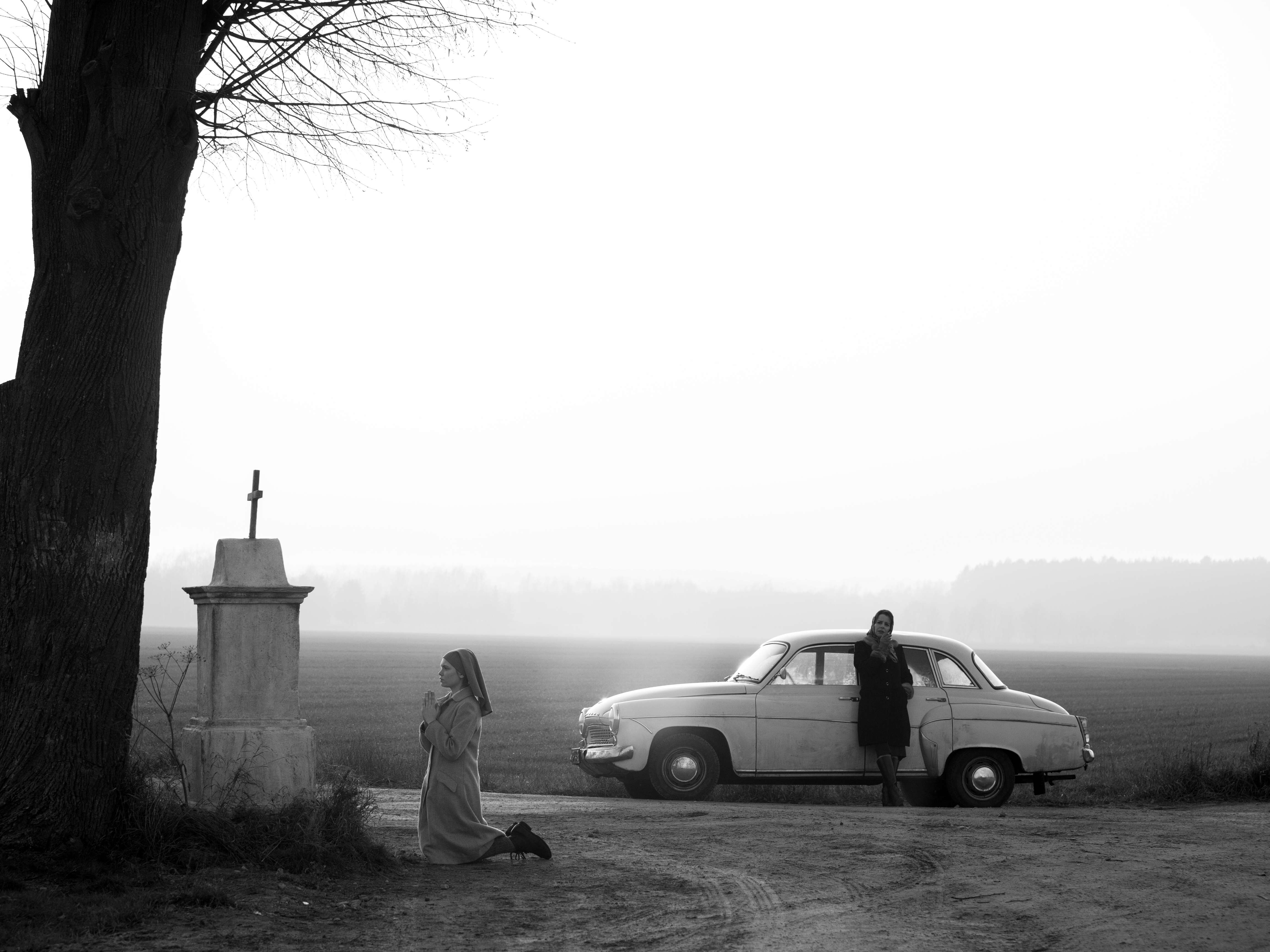
Even in wides, Ida is shown larger than life in way not possible with a wider format.
They went with a similar aesthetic choice for 2018’s Cold War which landed Żal an Oscar nomination. Here the square aspect ratio lent itself to painterly composition with Citizen Kane (shot 1.33:1) providing Żal with a template for building depth of field.
“The format allows you to suggest things beyond the frame,” Żal explains. “At the beginning of the film everything has depth and we place the camera high up with as many layers as possible.”
READ MORE: Behind The Scenes: Cold War (IBC 365)
Ida inspired director Paul Schrader to shoot 2017 drama First Reformed in 4:3. He explained that the aspect ratio “was about taking things away from you, taking the edges off the frame. When you start withholding things people become a little uncomfortable. Out of that disparity you can start to weave another reality.”
Confines the Characters
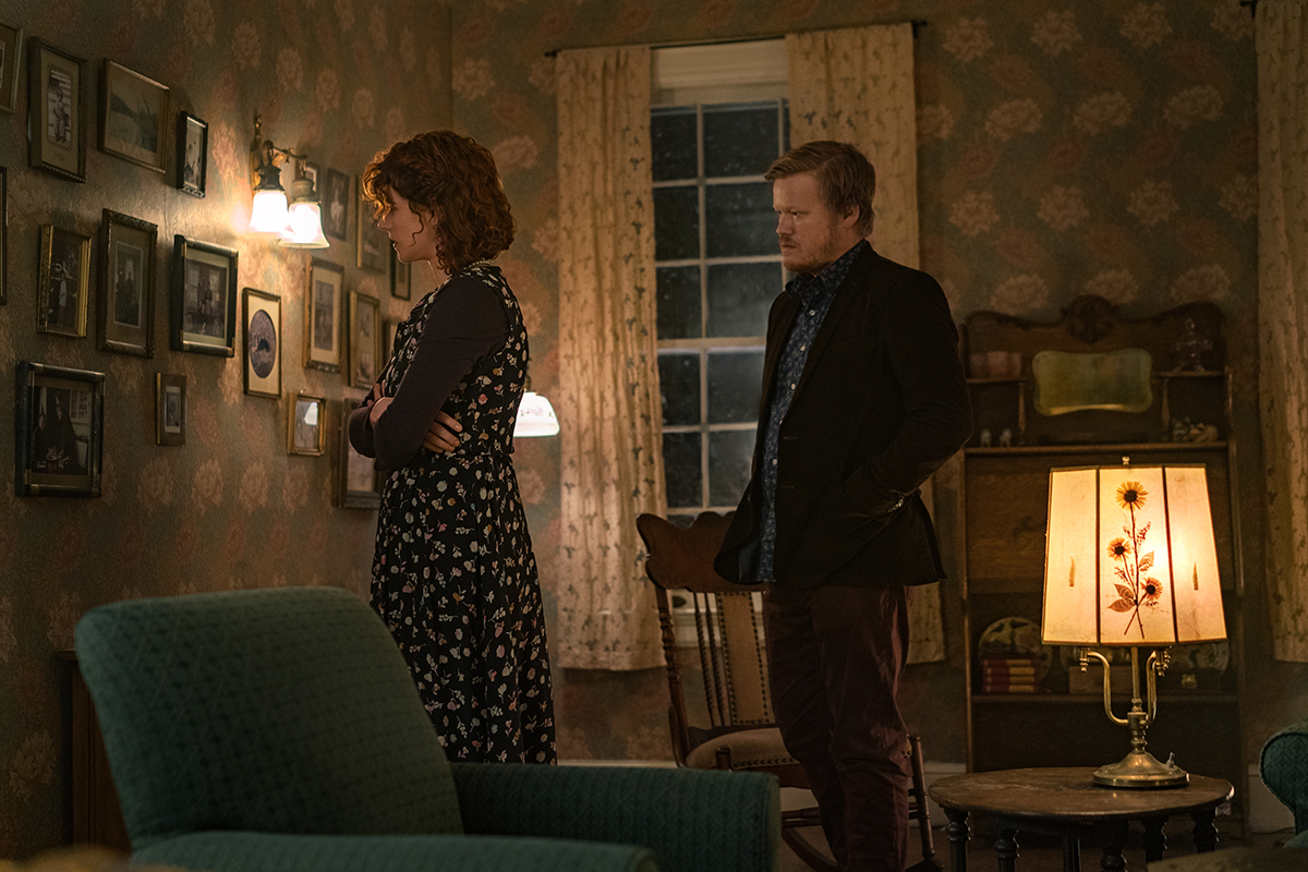
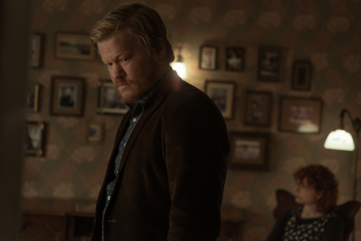
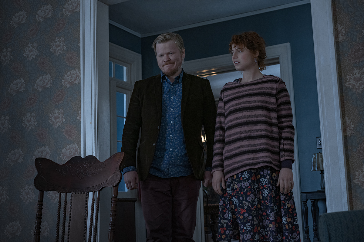
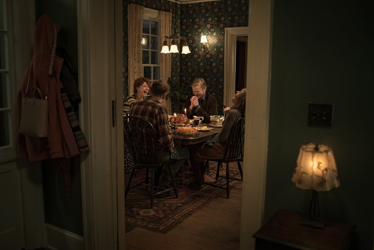
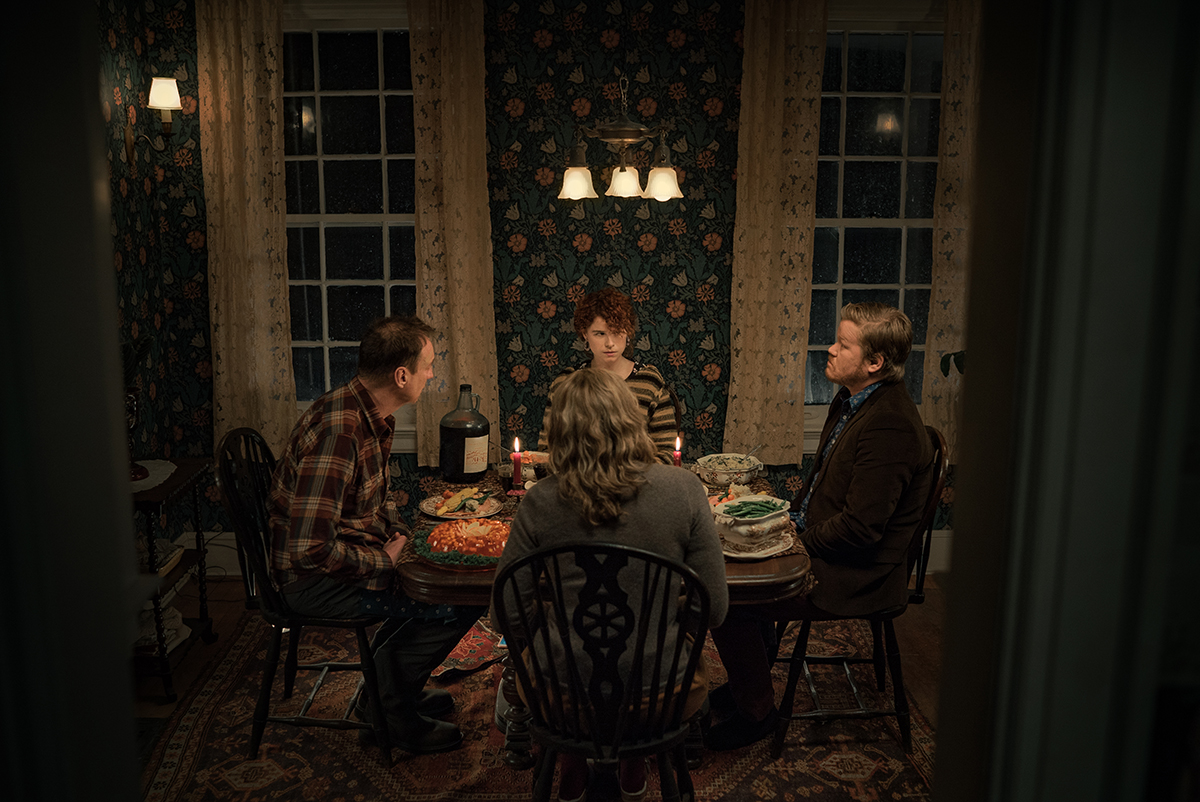
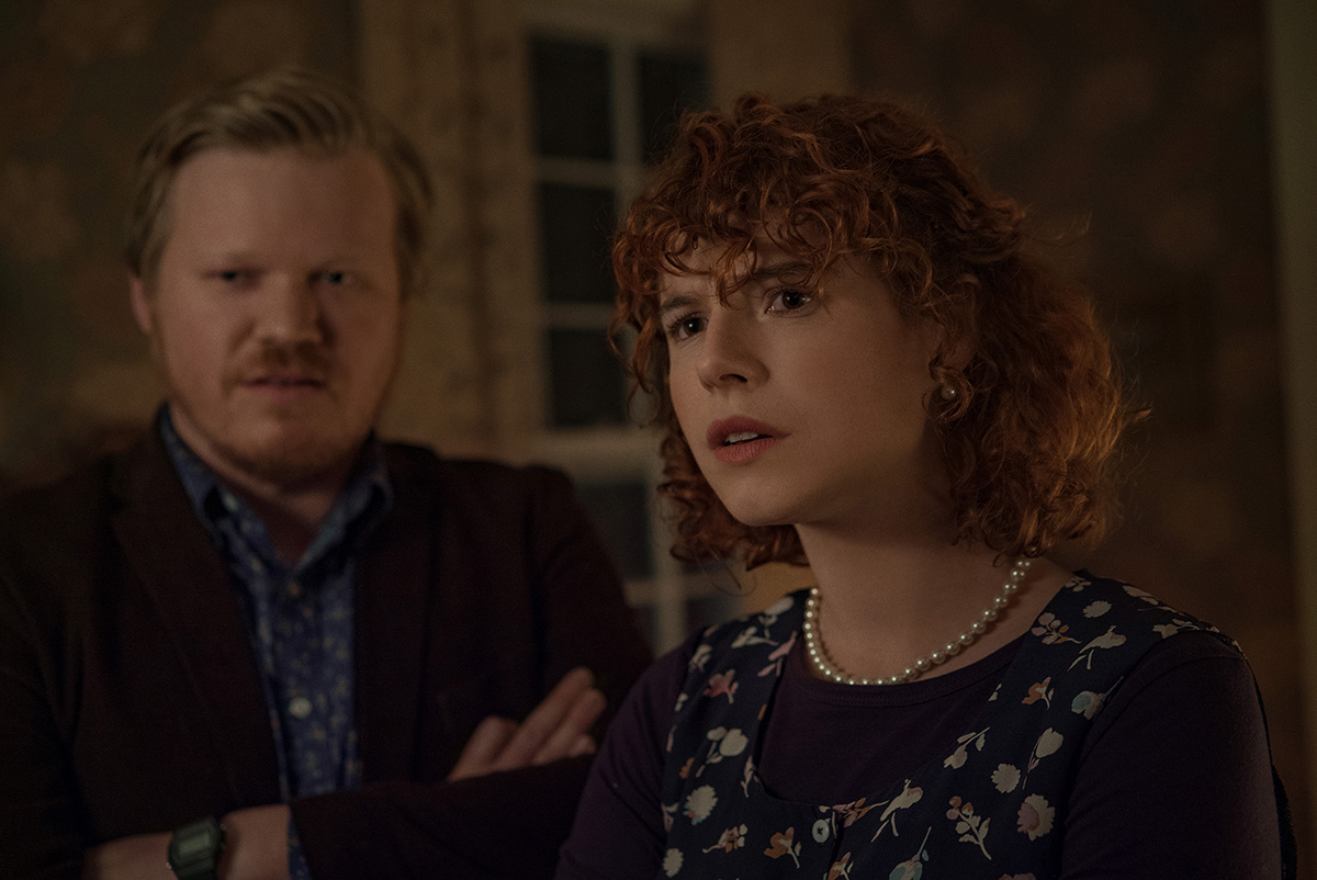
Other recent movies which have used a square frame to evoke claustrophobia, or horror, include harrowing concentration camp first person perspective drama Son of Saul and Charlie Kaufman’s study of depression and anxiety I’m Thinking of Ending Things (lensed again by Żal).
This box aspect ratio also drives the virtual lines forcing more of the human body into the frame.
For psychological horror The Lighthouse, director Robert Eggers and cinematographer Jarin Blaschke select a square (5:6) aspect ratio to confine the characters (Willem Dafoe, Robert Pattinson) inside the vertical lighthouse.
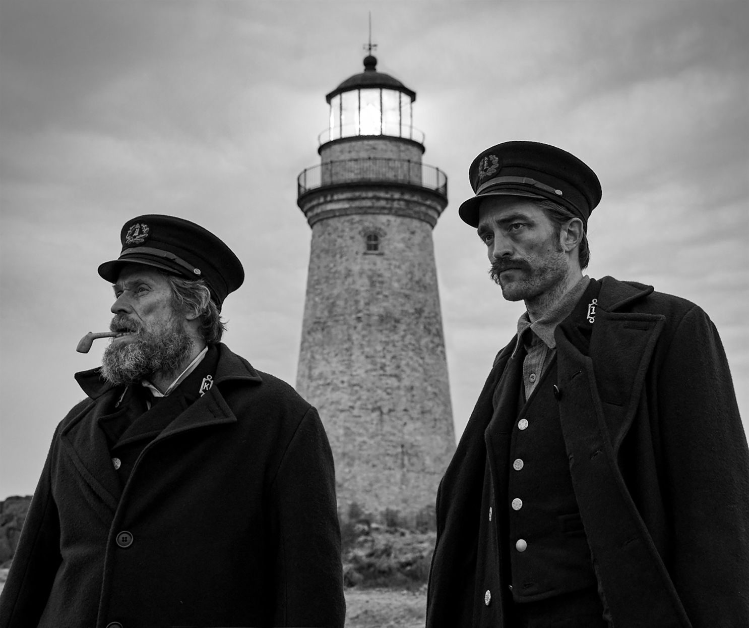
This seems to be the thought process of director Zack Snyder (more on that below) and Andrea Arnold who has shot her last three films in 1.37 including American Honey.
In referencing this Arnold stated, “My films are usually about one person and their experiences of the world. So, I’m mainly following them around, filming them quite closely. And it’s a very beautiful frame for one person. It frames them with a huge amount of respect.”
READ MORE: Director Andrea Arnold on the cross-country party that produced American Honey (The Verge)
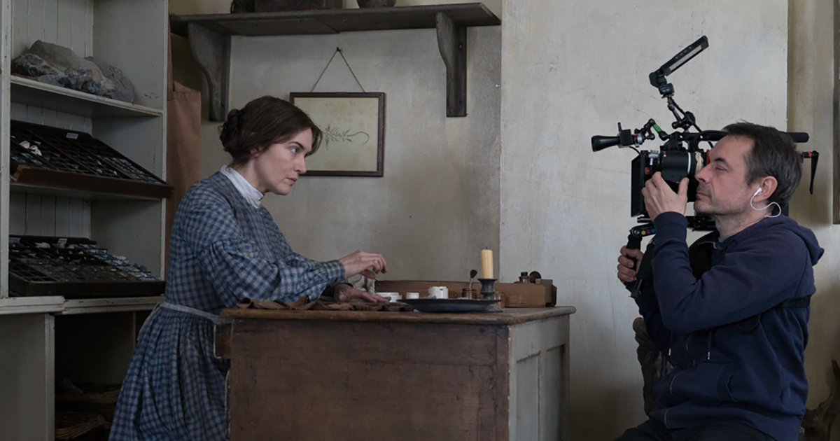
Cinematographer George Steel crafted the aerial vistas for Tom Harper’s The Aeronauts (2019) ballooning saga using spherical Panavision lenses in 1.85 contrasted with cropped aspect ratios for the flashback scenes on terra firma in 2.39.
These are all artistic choices but as Swinney observes, “using 4:3 surely seems more intimate and personal for drama,” than the ultra-widescreen of, say, The Hateful Eight.
“Ironically, while we may be accustomed to wide images on the big screen, outside of the cinema it seems we consume the majority of content on our phones which caters to boxier aspect ratios,” he says.
Changing Aspect Ratios Mid-Story
Trailers for widescreen movies are cropped down to a square for Instagram or Facebook. While this trend may be frustrating for some filmmakers, others are using it creatively to their advantage.
Steven Soderburgh’s feature experiment Unsane (2018) is screened with a ratio of 1.56:1 (close to the Academy ratio) perhaps because he no other choice given he was using an iPhone but suitable for a story of creeping paranoia and mental illness.
Season 1 of Amazon drama Homecoming used changing aspect ratios to relay different story timelines. The past is shown in 16:9, while flash forwards are told in an unsettling pillar-box (or iPhone vertical) 1:1.
“There was something claustrophobic and limited about that box aspect ratio that I thought fit what [the main character played by Julia Roberts] was going through in that [future] storyline,” series creator Sam Esmail said.
READ MORE: ‘Homecoming’: Julia Roberts and Sam Esmail Break Down Those Aspect Ratios, Long Takes, and Other Crazy Shots (IndieWire)
The 1:1 ratio also led to DP Tod Campbell’s favorite shot in the series, when an investigator goes down a flight of stairs. That might not sound compelling, but he frames the descent within the square ratio, dropping the camera down the stairwell with a graceful elegance. “Oh my god, it’s Vertigo,” he said. “I’m so in love with that shot. It’s literally the desktop to my computer.”
These choices stem from the indie filmmaking scene but have now bled into the biggest budget, highest profile episodic drama and studio features.
Marvel and DC Join the Party
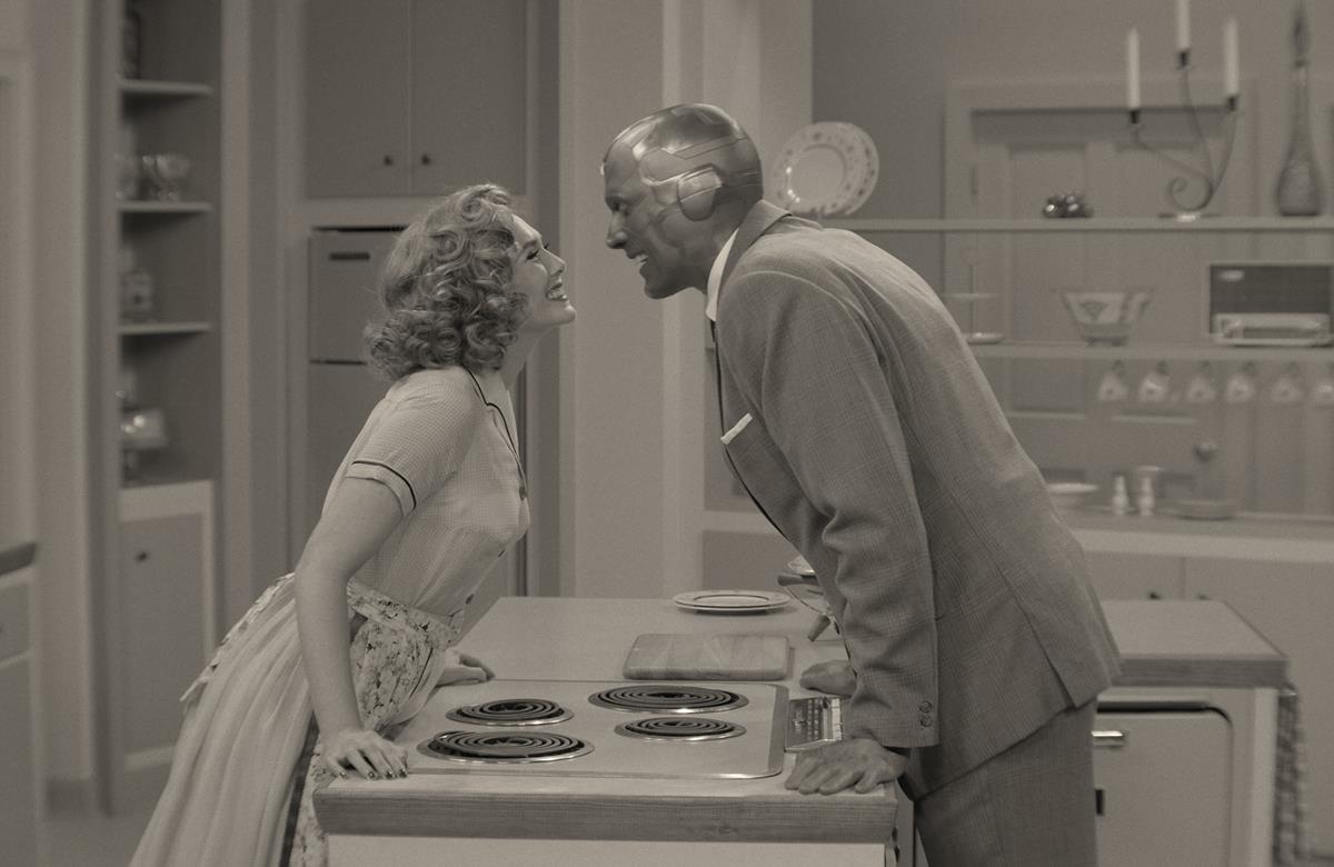
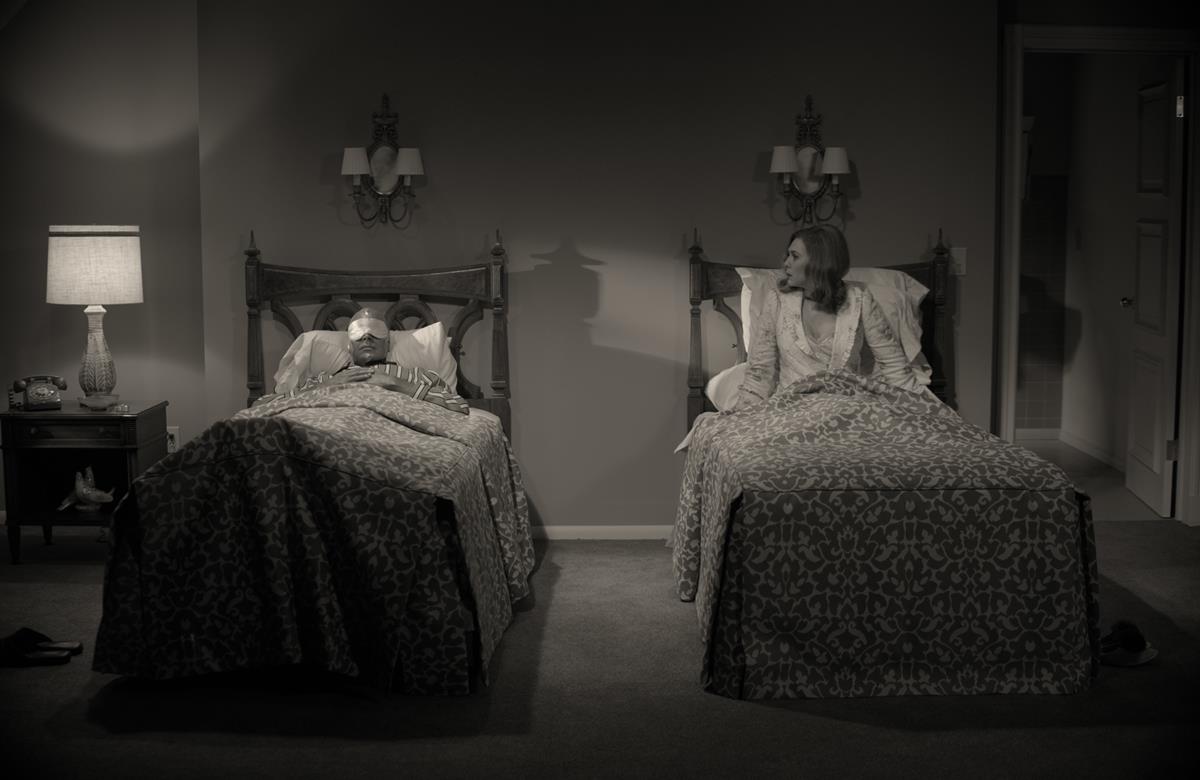
Disney+ series WandaVision used a variety of aspect ratios for different parts of its narrative which begins in 4:3 in homage to TV of the ‘50s, ‘60s, and ‘70s. By the time, Wanda has punched through the forcefield (called Hex) surrounding Westview into the Marvel Cinematic Universe in episode 3, the aspect ratio dramatically shifts from 1.33:1 (4:3) to the cinema screen ratio 2.39:1, explains DP Jess Hall. At the same time, the warm tones of the family sitcom are left behind for the cooler sheen of the MCU.
READ MORE: Behind The Scenes: WandaVision (IBC 365)
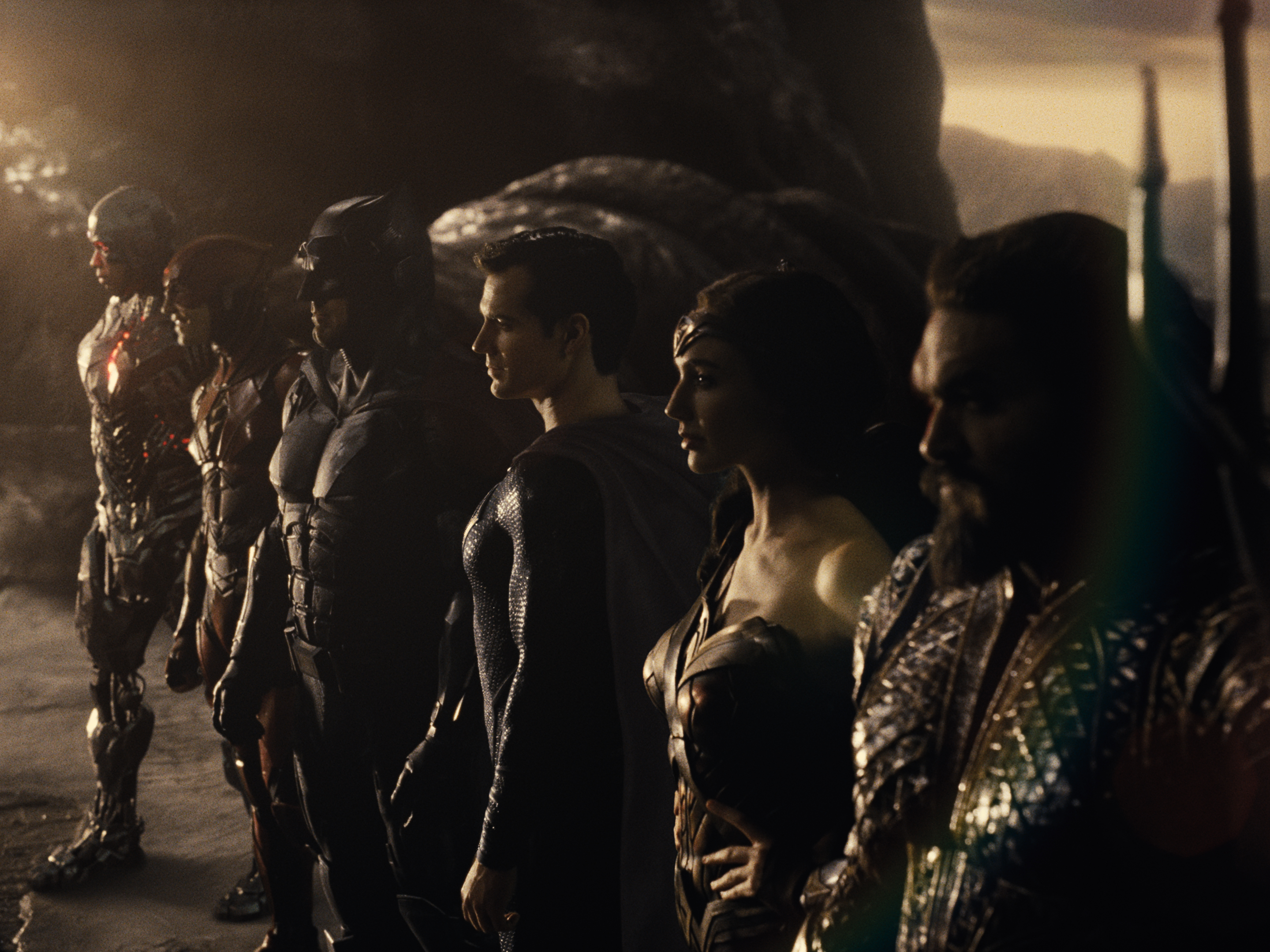
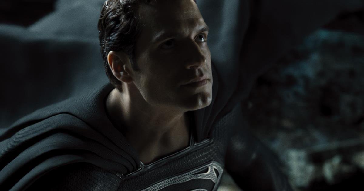
Then there’s the Snyder Cut of Justice League. The DC Universe blockbuster was originally released by Warner Bros. in 2017, this year recut and “restored” by the director.
During Justice Con, Snyder explained that re-watching the parts of Batman v Superman: Dawn of Justice filmed for IMAX, “really got me obsessed with the big square. My intent was to have the entire [Justice League] film play in a gigantic 1:4:3 aspect ratio on a giant IMAX screen.”
READ MORE: Zack Snyder’s Justice League aspect ratio explained: Why the Snyder Cut is not in widescreen on HBO Max (Games Radar)
There was another reason behind the sizing, too. Superhero characters tend to be shown in vertical compositions (unless its Superman flying) so for Snyder, using the 1.43 aspect ratio emphasizes this.
“I really started just compositionally falling in love with that concept,” Snyder said.
But since the theatrical version released with a different aspect ratio, some restoration work went in to readying the Snyder Cut for release. “Everything’s composed and shot that way, and a lot of the restoration is trying to restore the full frame. It’s like literally a restoration project at this point, because there were certain scenes that were just fucked up by the crop, so we have to kind of like fix it, a little bit,” he added.
Snyder also talked about the aspect ratio with The New York Times. “It’s in the same aspect ratio as First Cow [Kelly Reichardt’s 1820s set drama]. Those two movies share some common DNA, I think. I would love that in a double feature, First Cow and the Snyder Cut of Justice League.”
READ MORE: Zack Snyder’s Rough and Tumble Ride with ‘Justice League’ (The New York Times)
You can argue that deviating from standard aspect ratios especially within the same story is a gimmick if not used wisely. Filmmakers could be tempted to play with aspect ratio as a means to differentiate their film without grounding the choice in the story.
It’s a tool and like stereo 3D, editing, jerky camera-work or warped lens effects anything that distracts from the audience’s involvement in the story isn’t working.

