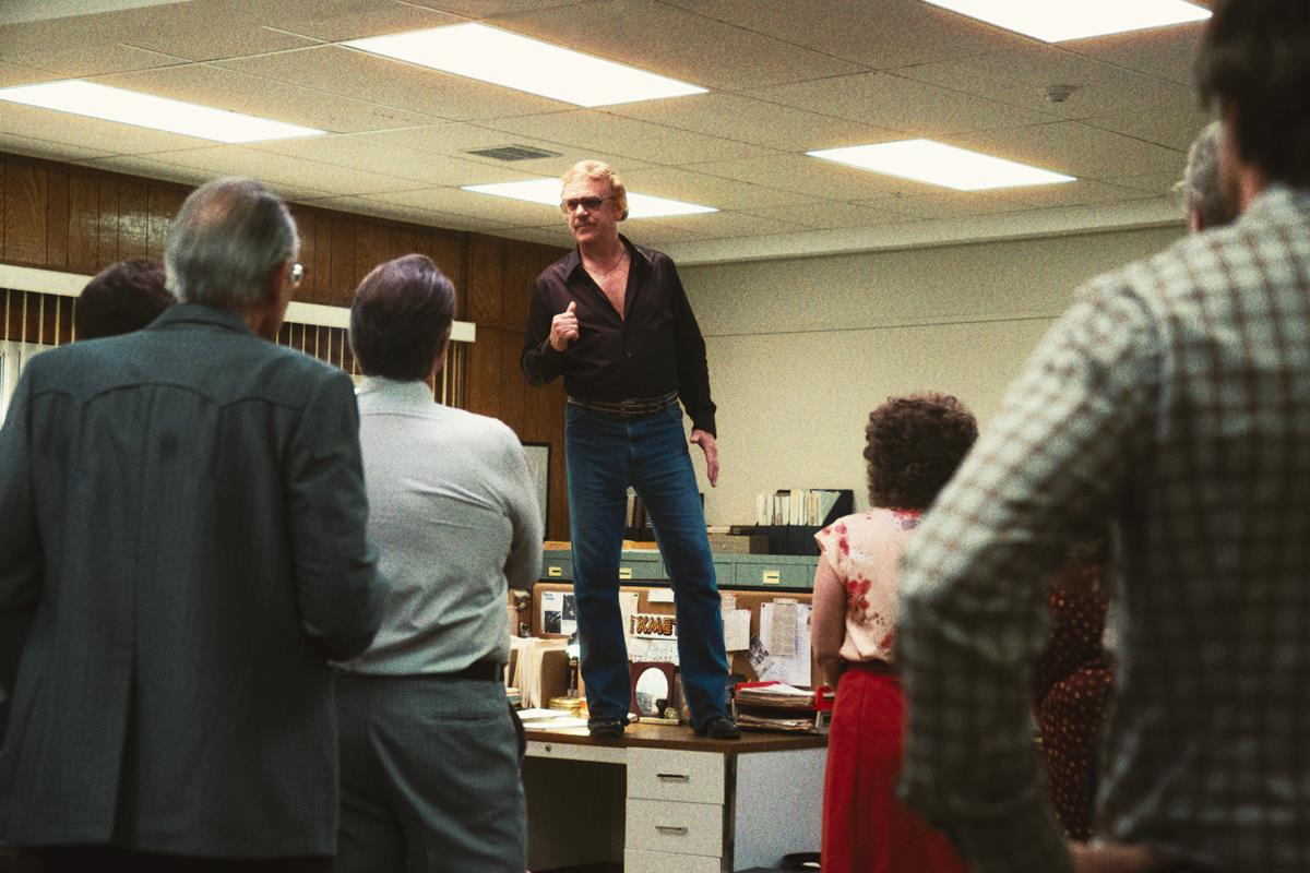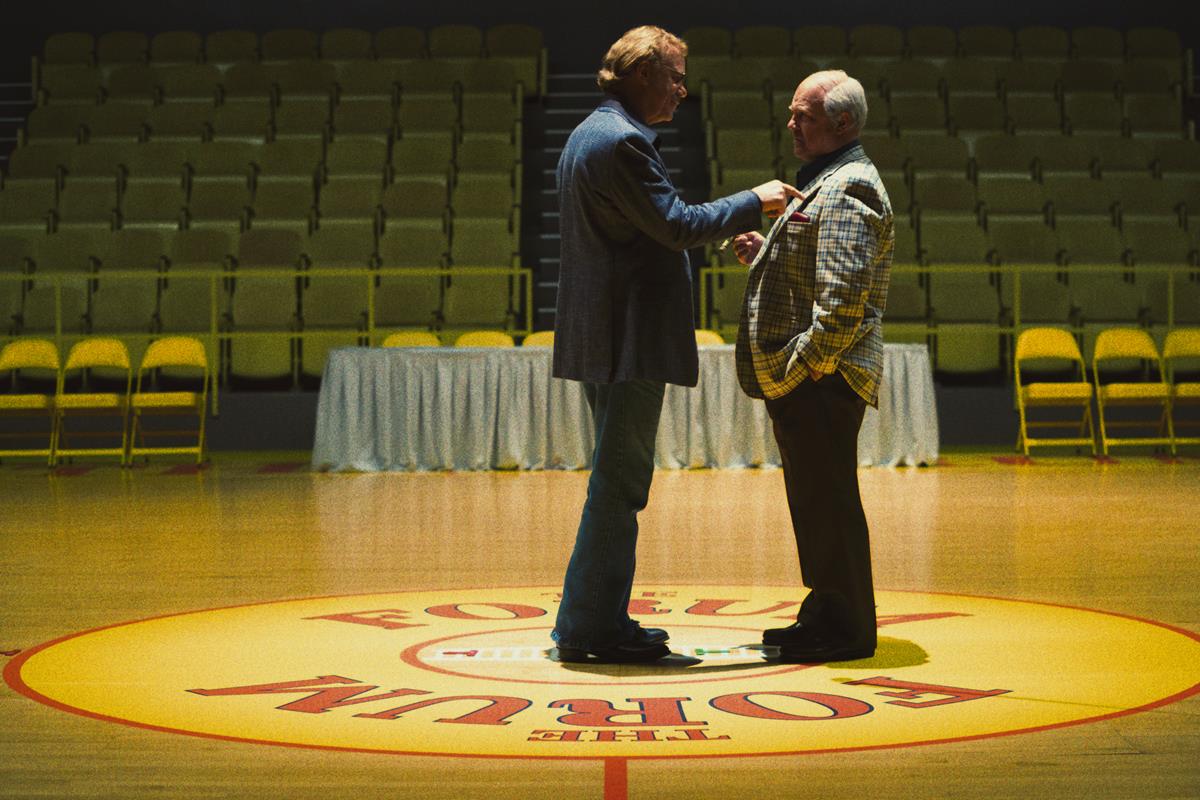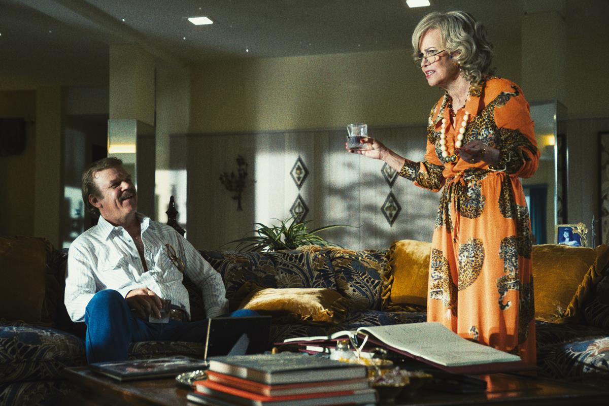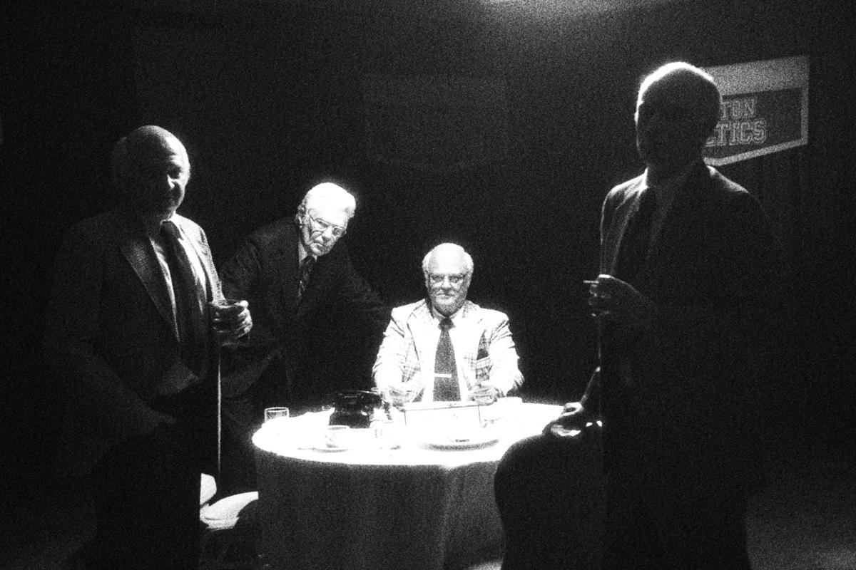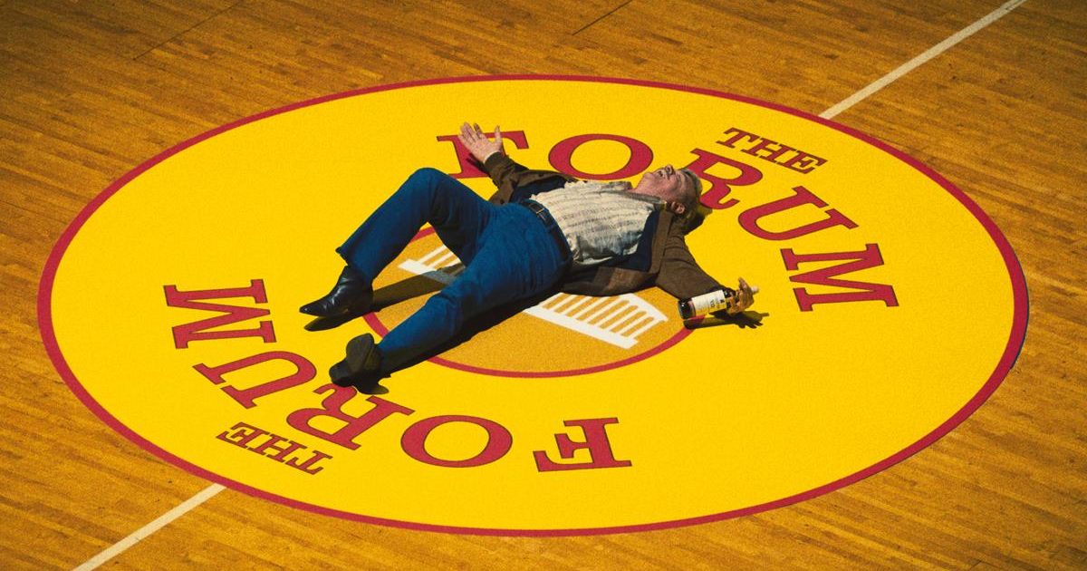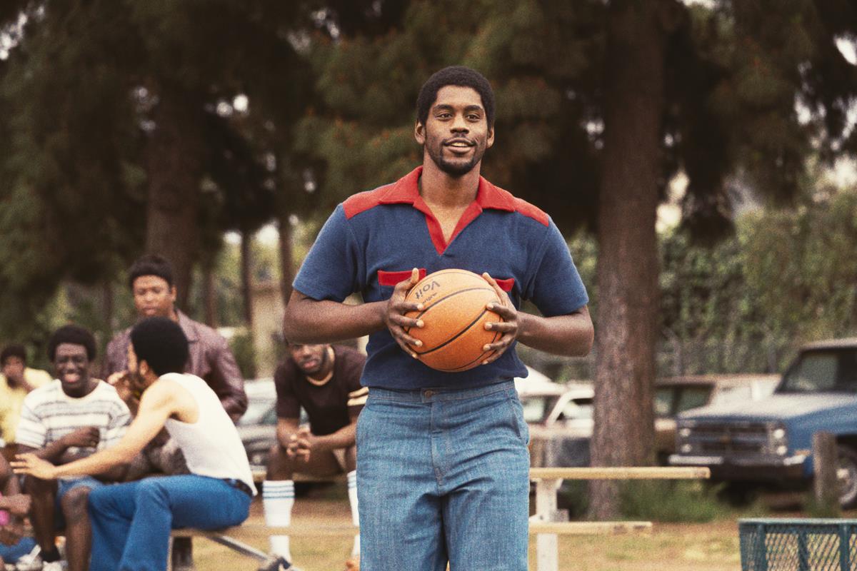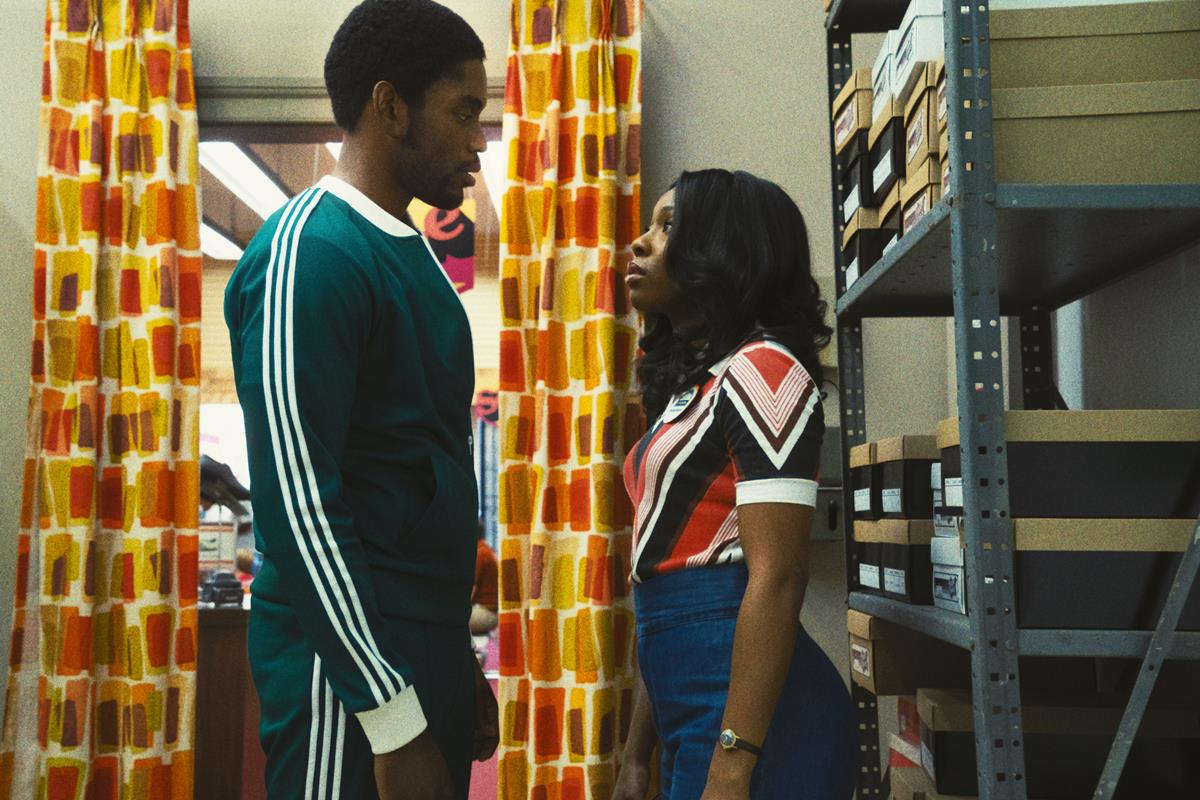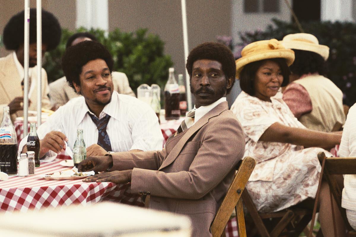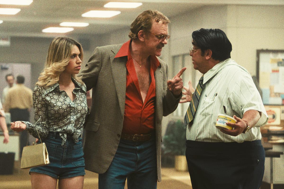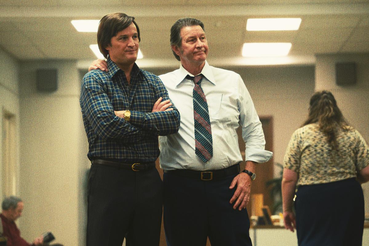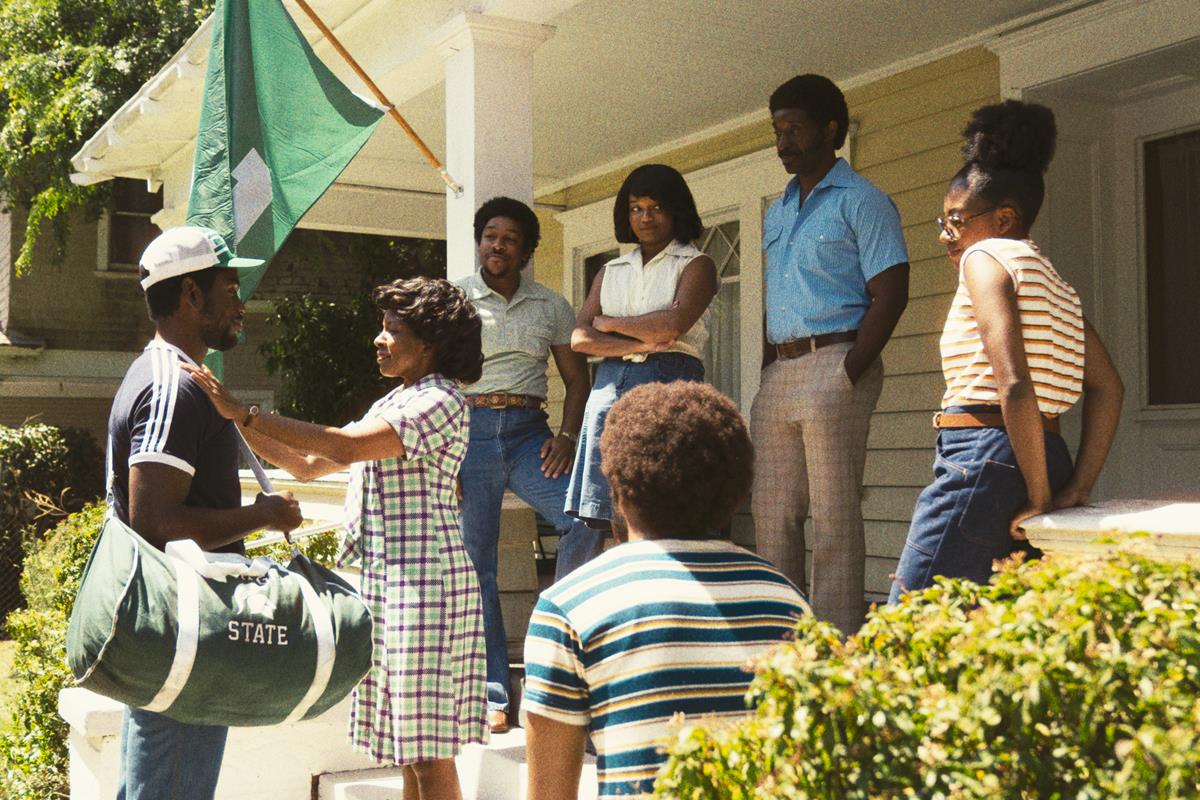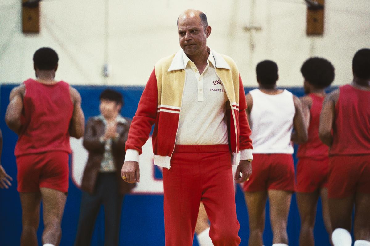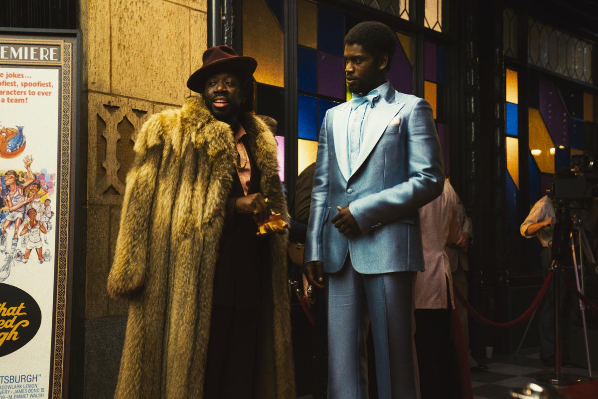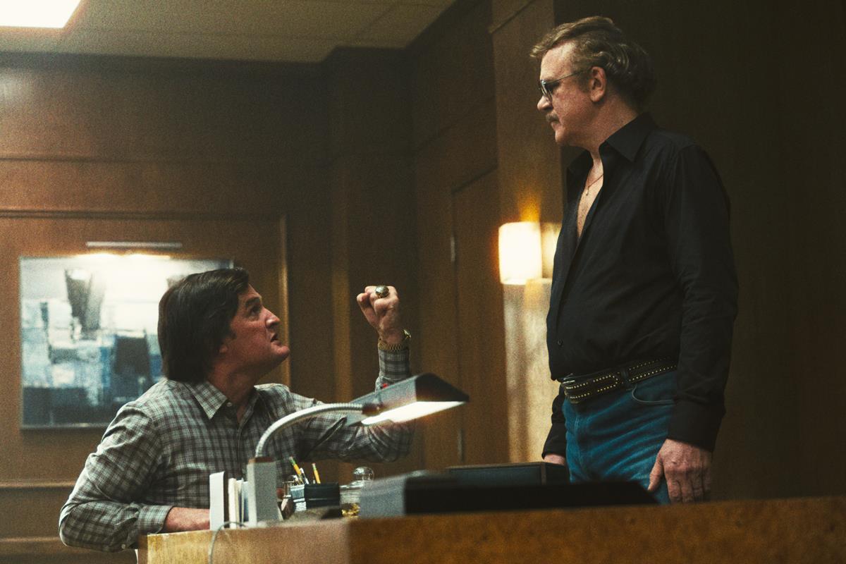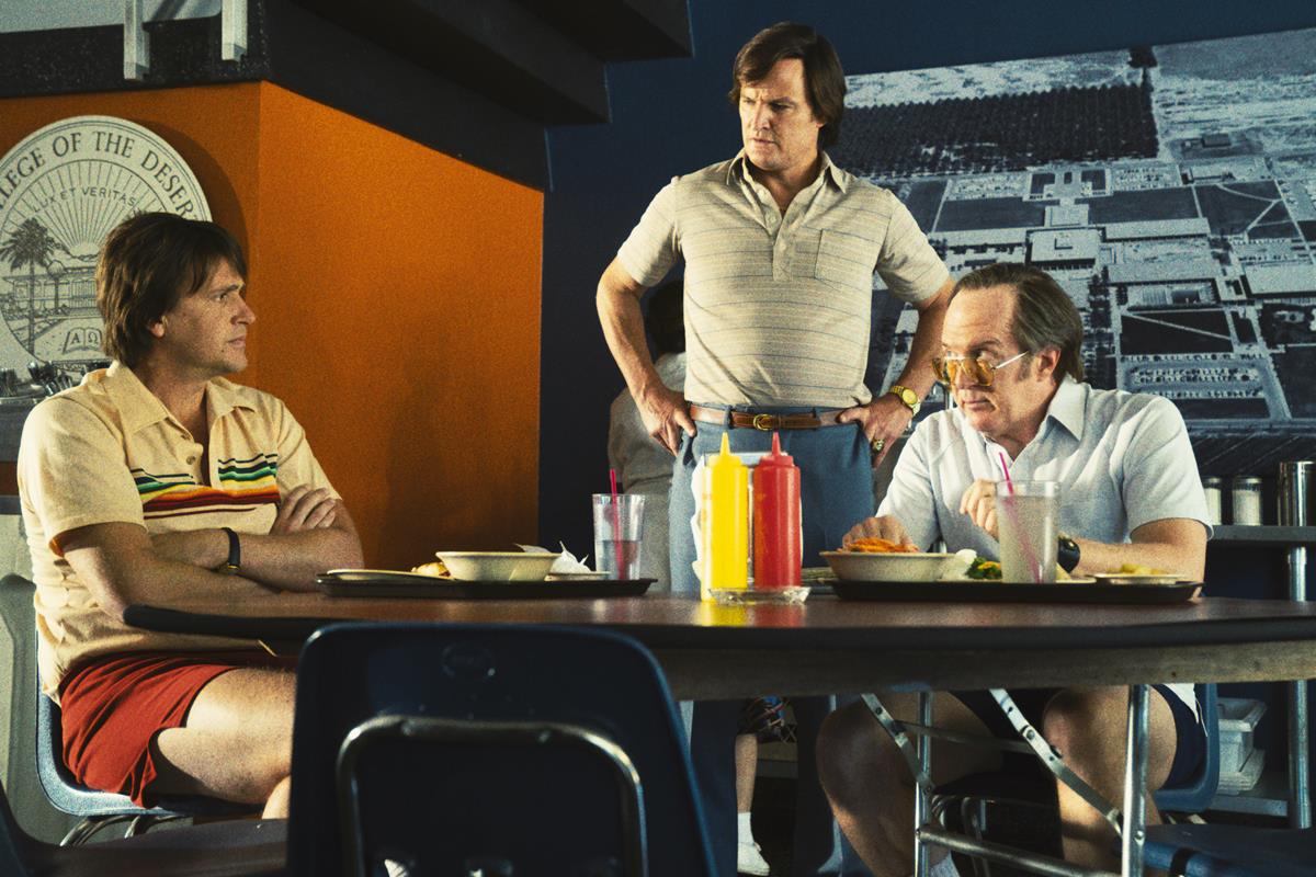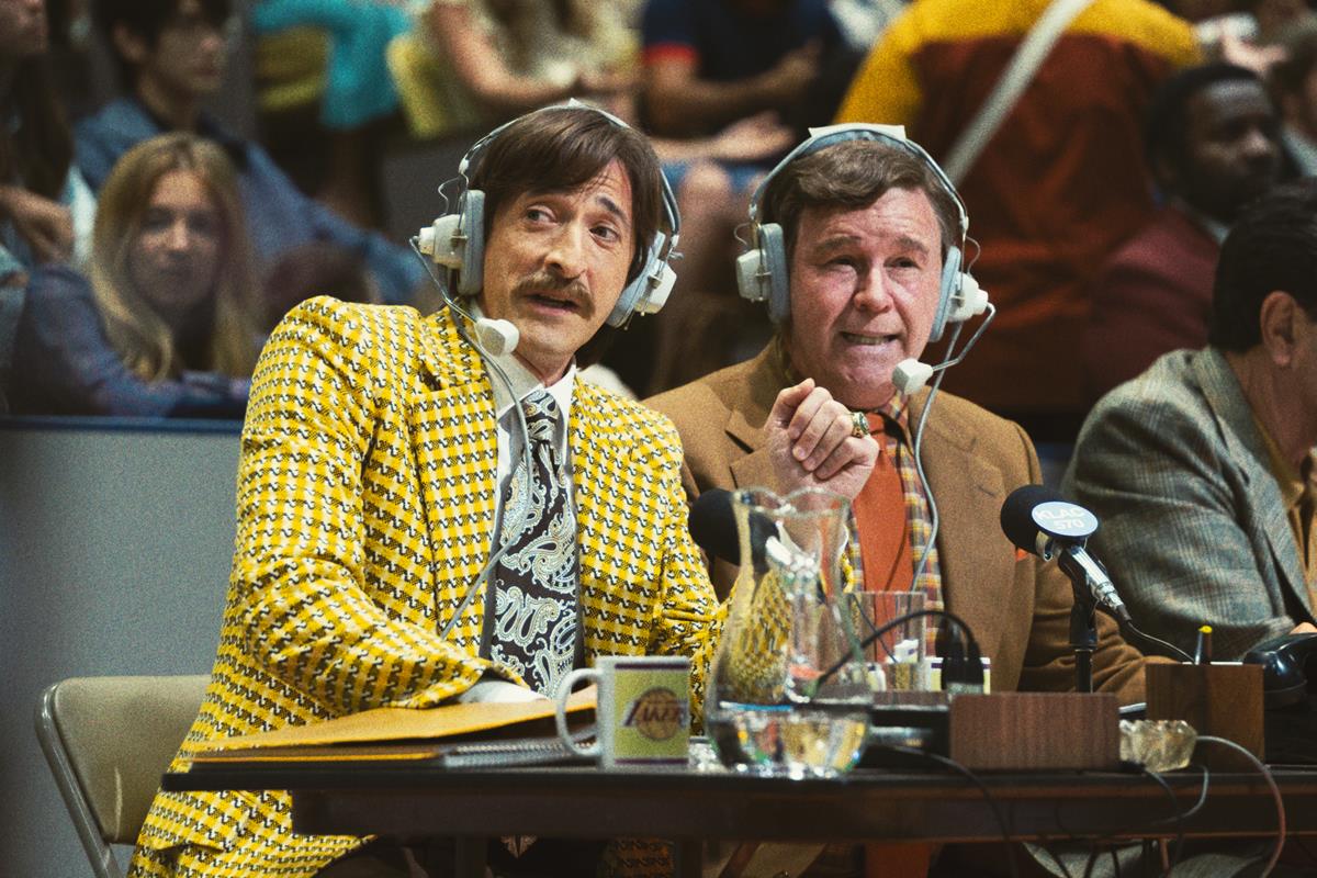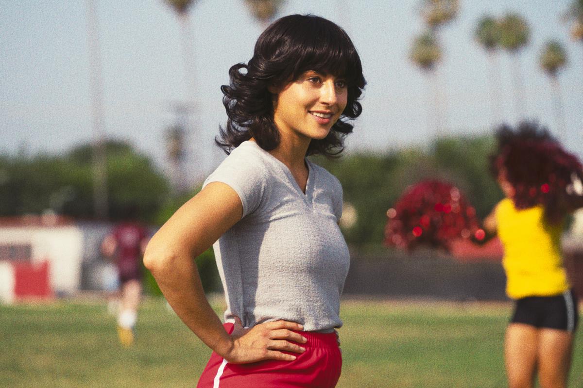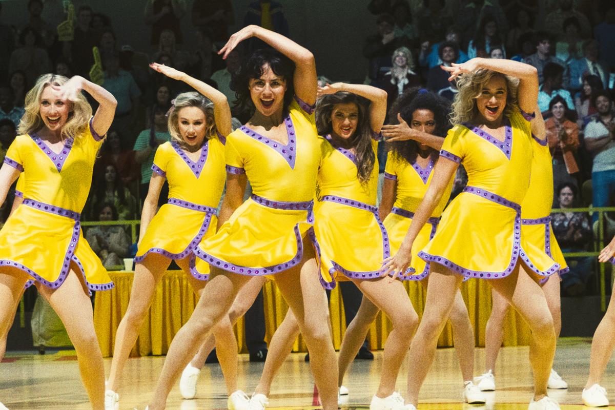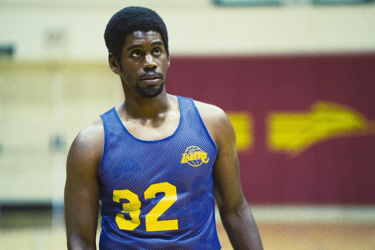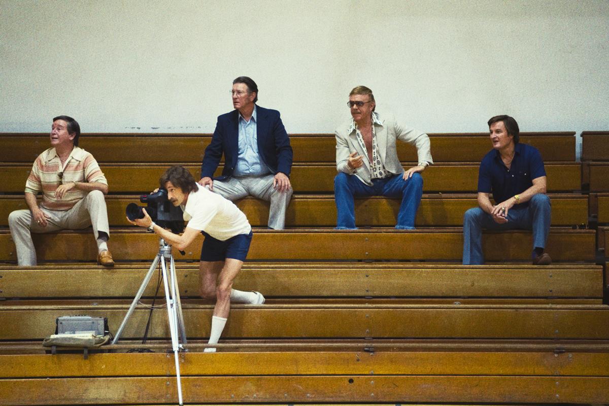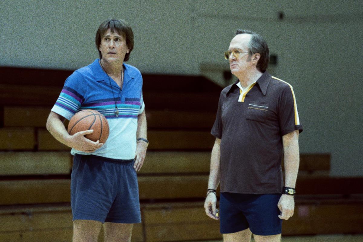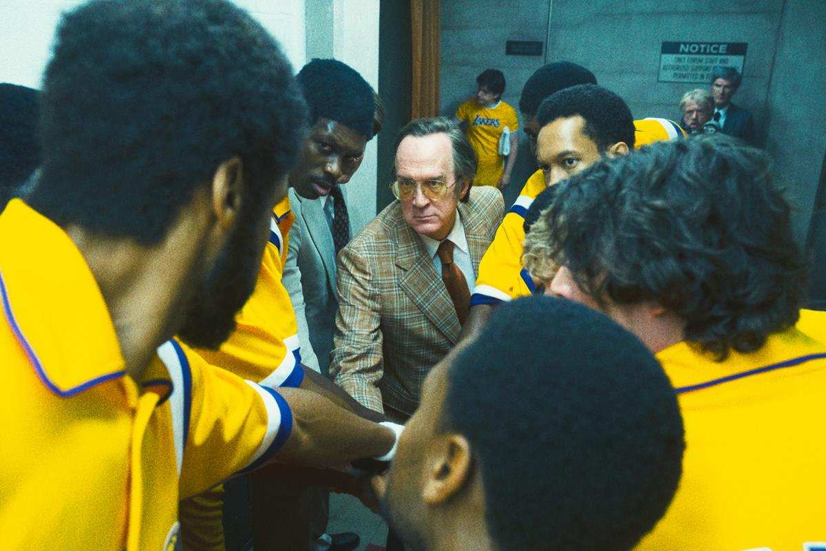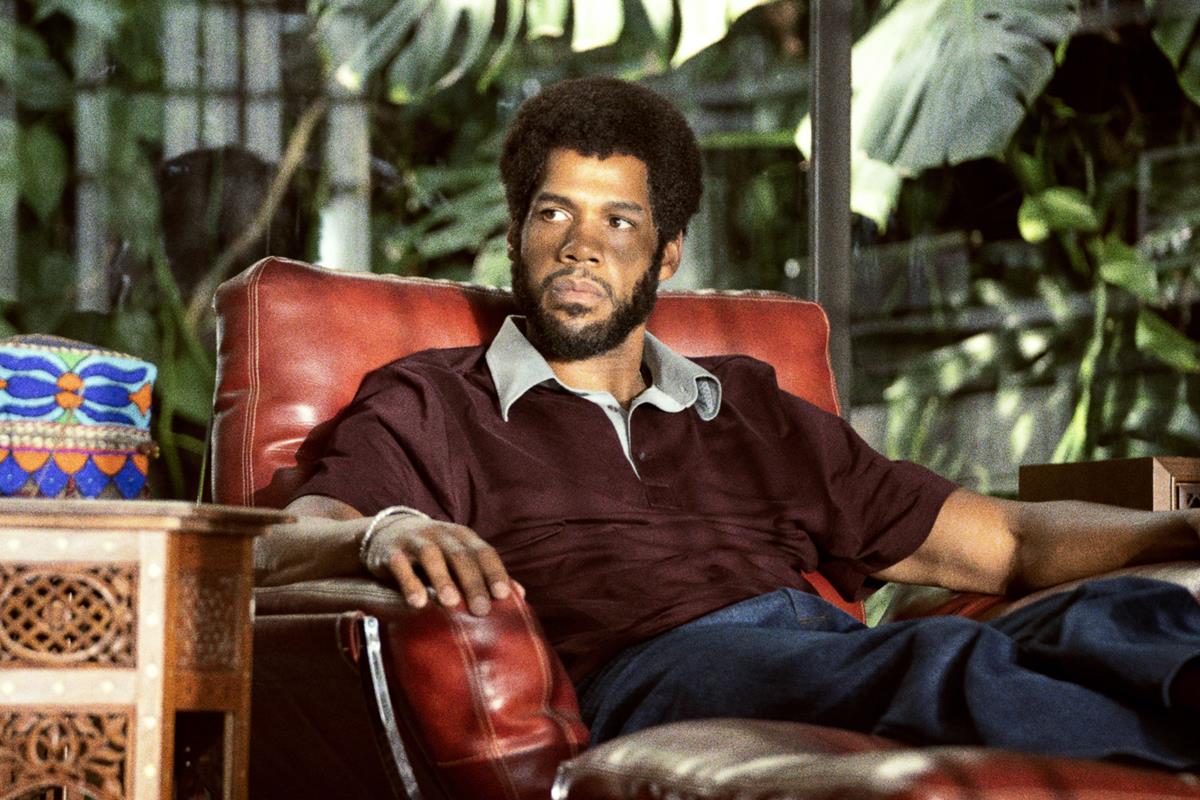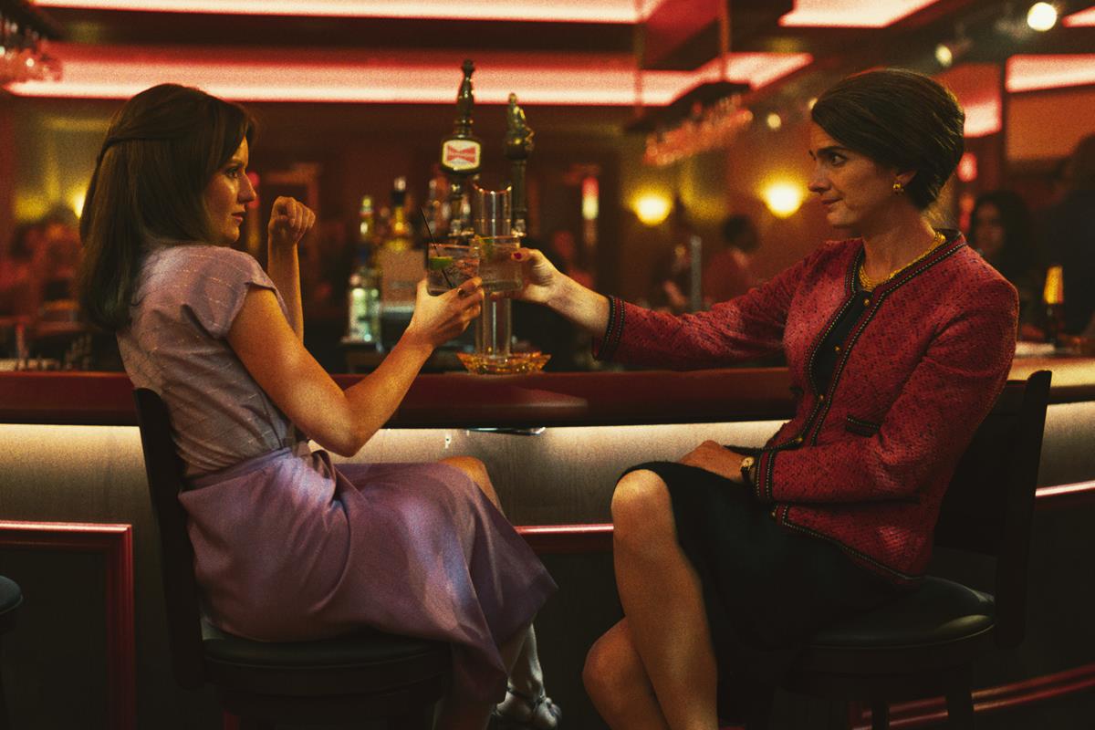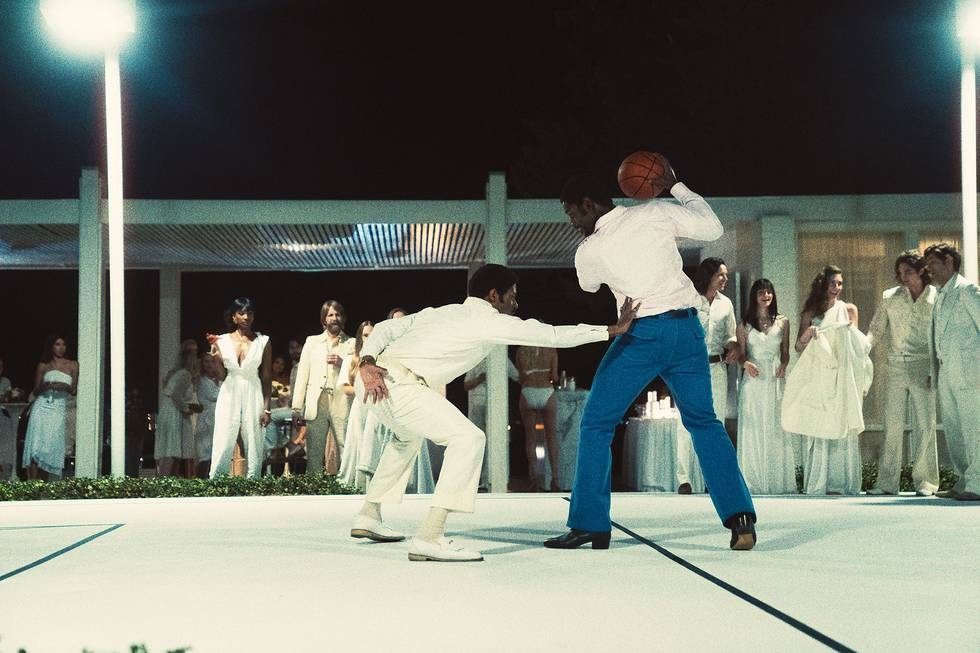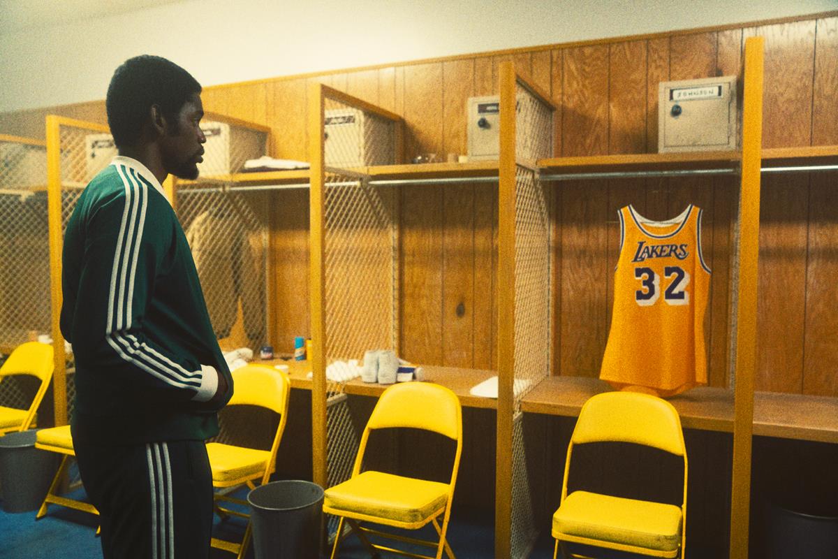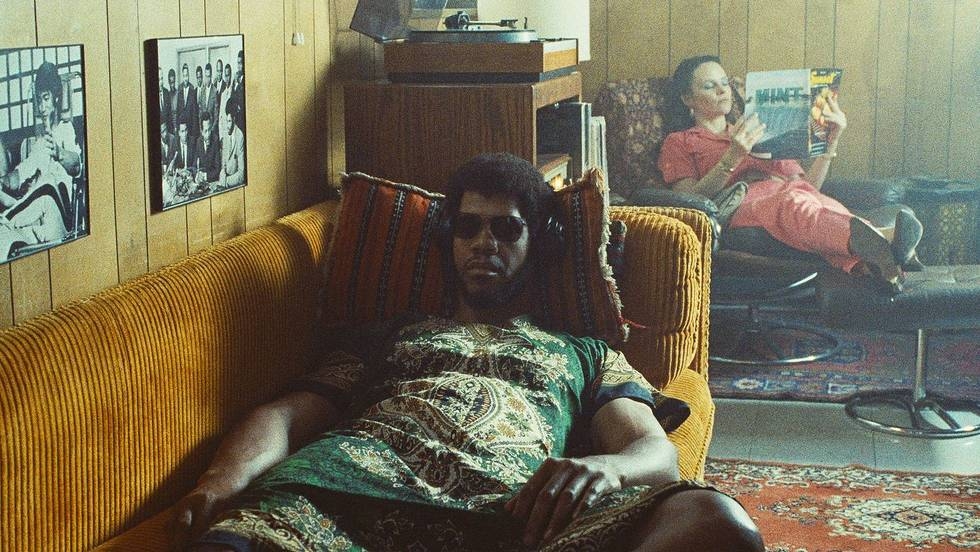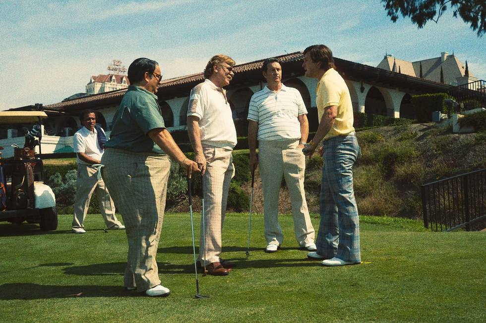
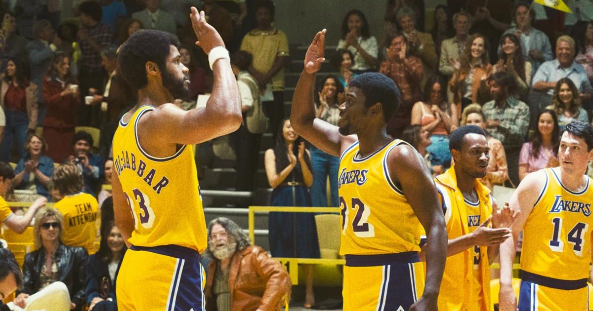
Produced and directed by Adam McKay, HBO’s new docudrama “Winning Time: The Rise of the Lakers Dynasty” shows how the Lakers changed the way basketball is played. Cr: Warner Media
The makers of HBO series Winning Time: The Rise of the Lakers Dynasty employed old- and new-school techniques to help transport viewers to the 1970s and ‘80s. The show, from director/producer Adam McKay, stars John C. Reilly as LA Lakers owner Jerry Buss and takes a dramatic, and sometimes comedic, look at the events leading up to the team’s transformation from an also-ran organization to the dynasty it became in the time of superstar lineup including Magic Johnson (Quincy Isiah) and Kareem Abdul-Jabbar (Solomon Hughes).
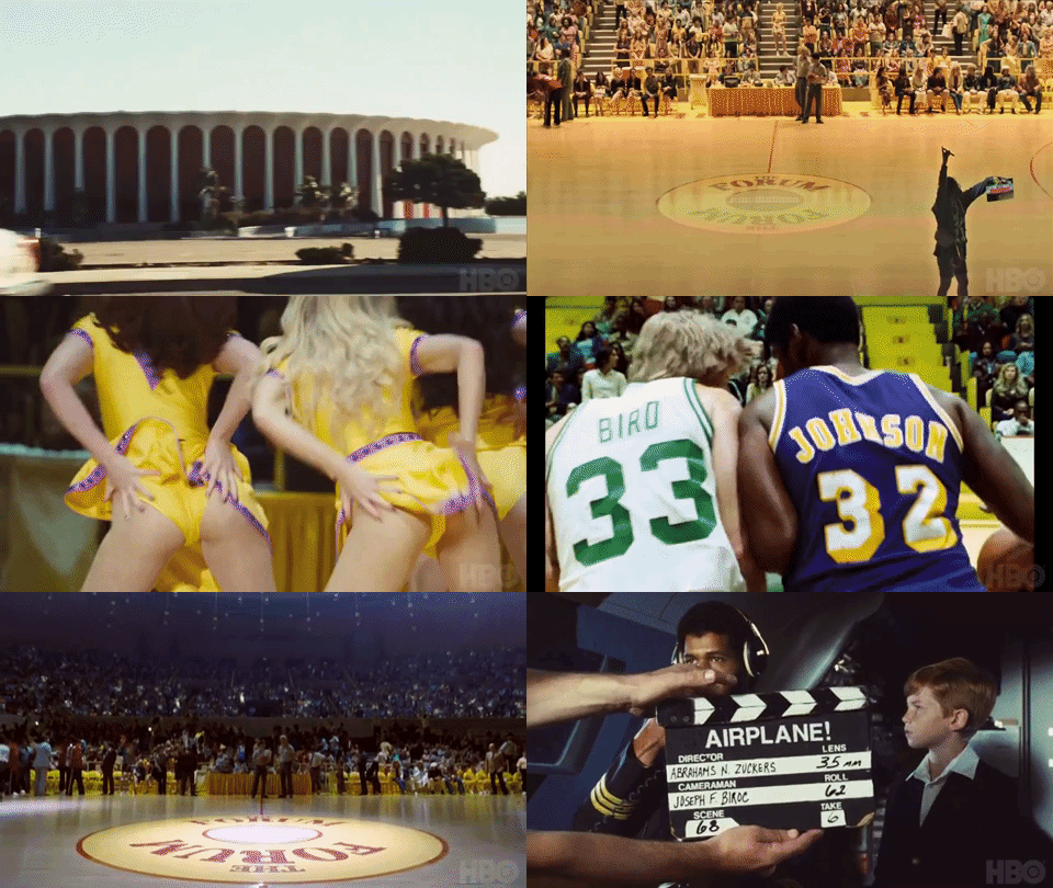
Cinematographers Todd Banhazl and Mihai Malaimare Jr. shot primarily on 35mm film but also utilized 16mm and 8mm and even vintage 1970s-era video cameras to produce the series’ unique look. Senior colorist Walter Volpatto of Company 3 Hollywood used Blackmagic Design’s DaVinci Resolve 17 to fine-tune the show’s look, often retaining, and even enhancing, artifacts of the older imaging technology.
“The idea was to capture not just the clothes and design of the period,” says Volpatto, who had previously worked with Banhazl on the intense feature Hustlers, “but also the overall look of the time. The discussion was, ‘Let’s pretend that this footage was shot back in the day sort of like a documentary and we found it now, years later, a little bit faded, a little beat up.’ So we did a whole lot of processing [in the grade] to bring everything back in time.
“If you think about stock footage,” he adds, “sometimes it was shot with film and then transferred to tape and the tape was probably compressed. So we needed to reverse-engineer all of this, take away the modernity of it.”
The concept, as developed for the pilot by Banhazl and McKay, along with writers Max Borenstein and Rodney Barnes, was to make the show seem to have been shot primarily in 16mm, which was assembled along with footage from all the formats mentioned above, frequently mixed together even within individual scenes. The filmmakers shot most of the dramatic action with either multiple formats concurrently or sometimes shooting takes for 35mm and then bringing in different cameras — 16mm or 8mm or NTSC video — for additional coverage.
“We knew,” says Banhazl, “that the show was going to mix our footage with period archival and photos, real basketball footage, famous news conference, and also bits of American pop culture and commercials from the time. In that way the style could feel like a collage — an American culture mixtape.”
The cinematographers shot with period lenses specifically because those optics tend to introduce a distinctive kind of flare that would have been far less pronounced with contemporary glass containing more sophisticated coatings. Lighting was handled in a style more suggestive of documentary work than of polished narrative films of the time, with the subjects generally well-lit but with that fall-off into a kind reddish milkiness of underexposed film. While Volpatto might instinctively want to dial in more contrast to such images to make them look “polished,” he knew he needed to hold back, even enhance those attributes to realize the filmmakers’ vision for the piece.
Picture editors were not too concerned with matching action; jump cuts were part of the aesthetic. Likewise, Volpatto didn’t focus on the shot matching that is so often a key function of the colorist, instead allowing, or again enhancing, the qualities that make the photographic formats look different from one another. Unless a cut was so jarring as to draw attention away from the story, the different looks were part of the aesthetic. The colorist summarizes his thinking on this, paraphrasing the popular ad campaign, “The idea was to have just the right amount of wrong.”
The bulk of the show was actually shot in 35mm film [Kodak Vision 3: 500T, 50D 250D], rather than the 16mm reversal which they emulated, primarily to ensure there was enough resolution to be able to manipulate the imagery in post, particularly for green screen work that would ultimately be comped with the large number of VFX shots which would recreate long-gone elements of Los Angeles.
Also, working with scans of 35mm neg, Volpatto explains, offered significantly more control over those artifacts — scratches, dirt, camera weave — that are naturally more apparent blown up from the smaller-gauge stock.
To make the 35mm-originated material look more like imagery that started on 16mm film and was subsequently telecined and left to sit around for years, Volpatto added visible perforations to many of the shots, as well as flicker effects and enhanced digital grain.
“The Kodak stocks have gotten better over the years,” Volpatto points out. “We wanted something not quite as good. Lenses, especially for documentary, weren’t that great then. So we looked into ways to mimic all that in an elegant way — not necessarily to match the look perfectly, but to add the look of the older stocks, the smaller film, the older lenses, and all of that.”
Volpatto graded through a film emulation LUT to constrain color and contrast to attributes available at the time. “It was difficult to find a true emulation from the period,” the colorist recalls, “so we started with a more modern one and then we heavily changed it to make the images look more like they were shot in the ‘70s and ‘80s.”
The DPs had actively worked to capture grain in the film images through underexposure/push processing and Volpatto subsequently utilized his arsenal of digital techniques to capture some of that actual grain from scanned portions of 35mm, 16mm and Super 8mm film and then layer it in using Resolve to finetune the behavior of the added grain to make it respond to light and dark regions of the frame in a natural-feeling way.
The colorist worked with Banhazl early on to introduce “camera weave” into the 35mm-shot material. “We looked at a test of 35mm and 16mm [images] shot with a tripod,” Volpatto recalls. “Obviously, the 16mm shots had more weave. I used a nice resolve plug-in called Camera Shake and modify the intended use of it to introduce weave into the 35mm material to make it look more like 16.”
Some portions of the show were captured on actual 16mm film [Kodak Double X and Tri-X, along with some Vison 3 negative]. “When you see the photographic choreography of the players playing basketball,” Volpatto explains, “there was a camera operator on rollerblades chasing [the action] with an old 16-millimeter [ARRI 416] camera and vintage [Zeiss Ultra Speed] lenses. The shots are absolutely amazing!”
There is also a significant amount of material throughout the series that was shot in Super-8, which was processed and scanned at Burbank, CA-based PRO8MM.
To reproduce the look of videography at the time, the production found and revived some vintage Ikegami ITC-730A and HL-79 tube-based video cameras. “They were literally either in a museum or sitting in an old stockpile,” Volpatto notes. “They put together an array of cameras before they started shooting. Some of them worked, some of them didn’t, and some of them were valuable for spare parts,” Volpatto recalls.
“We used the video material both to recreate basketball on TV and for also for subjective emotional moments,” Banhazl adds. The cameras pulled the NTSC signal and recorded it digitally to pix 240 recorders. In the grade, Volpatto says, “We would further process it to enhance the look and feel of the old NTSC video recordings.”
“Sometimes we wanted the Ikegami video footage to feel like cheesy TV from the time, and sometimes we wanted the interlaced low-resolution aesthetic to strip down the characters and see them in a more vulnerable human way.”
NOW STREAMING — BEHIND THE SCENES OF FAN-FAVORITE SERIES:
As the streaming wars rage on, consumers continue to be the clear winners with an abundance of series ripe for binging. See how your favorite episodics and limited series were brought to the screen with these hand-picked articles plucked from the NAB Amplify archives:
- “Severance:” Now, About Solving the Work/Life Balance…
- Entering “The Gilded Age”
- Class Is Definitely Not In Session: The Horror Delights of “All of Us Are Dead”
- “The Dropout” Is a Slow-Motion Car Crash (and We Can’t Look Away)
- The (Unavoidable) Universal Appeal of “Squid Game” Is By Design
Some of what the production did to imbue the archival look was as simple as asking the film lab, FotoKem, not to pre-clean the negative before scanning and not to dust bust afterwards. It was also very important to coordinate with the dailies colorist — also at Company 3 — so that when he received the film scans he understood that what looked like mistakes from the lab were actually a deliberate part of the process, and that he should not clean things up or fight the look to make the images seem “better.”
“The instinct of a dailies colorist is to make everything look balanced and neutral,” says Volpatto. “But that is not the look we were all after. There are a lot of biases, especially in the blacks, and it was important that everyone who saw the dailies was able to get some kind of an actual representation of where we’d be going with the look in final color.”
Toward that end, the DPs carried a RED Komodo during the shoot with some of the digital film look applied as a LUT that Volpatto had created specifically for the Komodo and matched as much as possible to the intended final look.
“When you are doing something where there is no true white point in the image and the blacks are super dirty and there is green or magenta in the skin tone,” Banhazl explains, “there are just so many things that could be considered ‘wrong’ — things a dailies colorist might want to ‘fix.’ The Komodo was kind of like our digital ‘Polaroid.’ I could send stills from that camera to the dailies department. The dailies colorist could focus on matching the skin tones to the stills and let the rest of the images fall where they fall.”
Winning Time is a special series for the cinematographers and Volpatto. “It was a blast,” Banhazl enthuses. “It was like playing jazz with a group of brilliant talented artists.”
“This was such fun show to work on,” adds Volpatto. “We were so free. We didn’t have to make everything ‘perfect.’ It’s supposed to have a bit of a grungy style and it’s been very rewarding to be a part of creating that look.”


